
Using Design to Engage Patients
UX/UI Design | Branding | Healthcare | Design Systems | Digital Marketing
Creating accessible, patient-centered websites that better reflected healthcare services, increased patient acquisition through digital leads, and aligned the design system across all digital touchpoints.
Overview
As Director of Marketing Operations, I led the full redesign and rebuild of Mountain Spring Vascular’s digital presence, including two major site overhauls and the creation of two new sites from the ground up. Working with limited time and resources, I applied UI/UX research and design principles to make the sites more accessible, patient-friendly, and aligned with business growth goals.
Within three months of launch, the redesigns delivered measurable results (below).
Please note that certain details have been limited due to a non-disclosure agreement (NDA). If you have specific questions and are interested in learning more about how I approach healthcare UX, please reach out to me.
Role
UX Researcher & Designer | MarTech Manager | Project Manager
Client
Mountain Spring Vascular (4 brands under multi-specialty group)
Jump to

Key Outcomes
168% Increase
in monthly site visitors within 3 months of launched website redesigns.
400%
in appointment requests submitted through website forms each month.
106% Increase
in monthly number of new patients within four months of launching redesigns.
How did I turn a business goal into a project brief?
Business Goals
01. Increase revenue with increased number of new patients each month
02. Support opening of new office locations by prioritizing digital marketing
The existing sites were fragmented and outdated, with inconsistent branding, confusing navigation, and patient forms that failed to meet HIPAA standards.
Patients — many of whom were older adults or caregivers — struggled to find the information they needed quickly.
At the same time, leadership wanted to accelerate growth and increase lead capture.
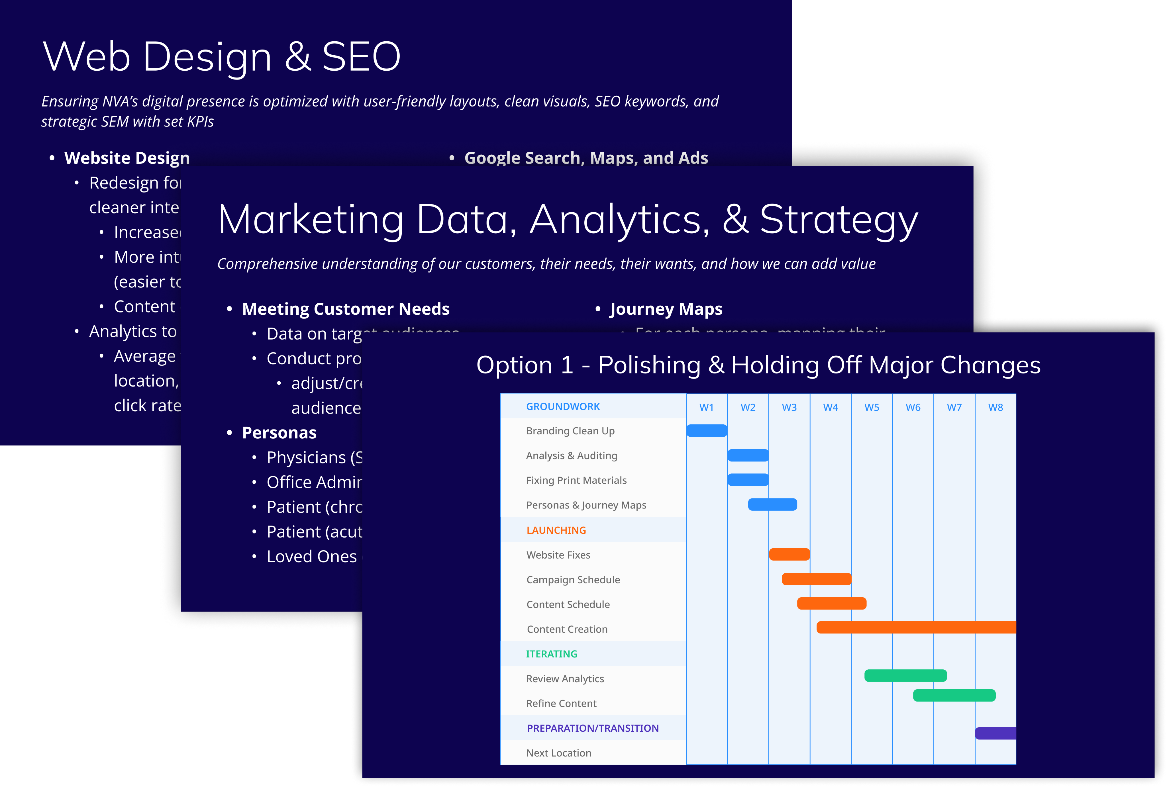
My goals were to address the major security and HIPAA issues, and launching website redesigns with a solid branding package and core pages ready. The second stage of this project allowed for the full buildout of the website informational pages as well as creating the supplemental print materials.
How did I establish a data-driven direction?
With no time for formal usability testing, I conducted rapid, scrappy research to understand user needs:
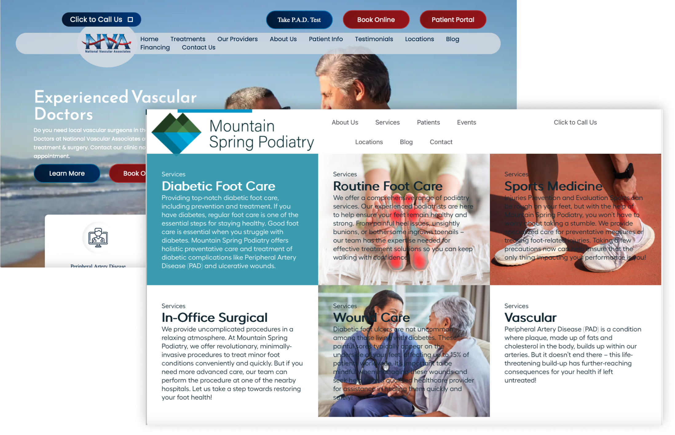
- Competitive Analysis: Comparing aspects of regional vascular and podiatry practices revealed clearer pathways to appointments and stronger trust-building cues.
- Quick Interviews: I sought short, informal interviews from clinical staff and operations staff to understand some of the pain points they noticed.
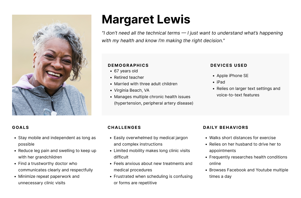
- In-Office Observation: Based on observing the waiting room, the primary users were older patients or caregivers seeking trustworthy, professional care with minimal friction.
- Data Analysis: I found relevant demographic data in the EHR (electronic health record) and supplemented lacking areas with open-source data from the CDC, Medicare.Gov, and regional health data sets from UVA.
These findings guided 3 design priorities:
01.
Accessibility and responsiveness were vital. Our users tended to be older adults or caregivers who used smart phones with increased text size, so WCAG-compliant typography, contrast, plain language, and clear breakpoints were necessary.
02.
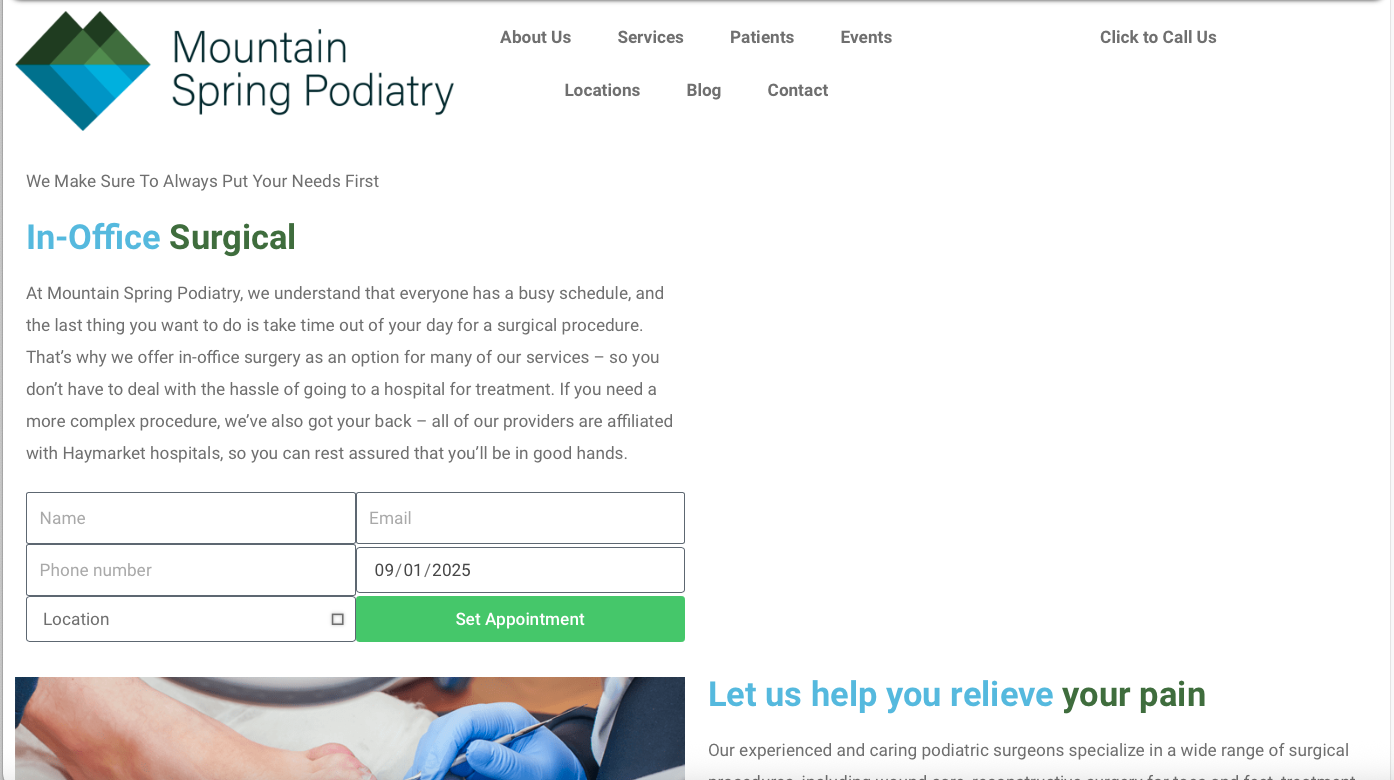
Simplified user flows with clear calls to action for requesting online appointments, paying bills, signing in to the online patient portal, getting directions, and calling the office. This also included better form design for submitting an appointment request.
03.
Visible trust signals, including provider credentials on the front page, HIPAA-compliant badge on the forms, linked Google business profiles, and clear language.
Current Issues
Inconsistent visuals and branding
Unoptimized navigation for patient users
Lack of digital HIPAA compliance
Lack of accessibility and responsive sizing
Project Constraints
Inconsistent visuals and branding
Unoptimized navigation for patient users
Lack of digital HIPAA compliance
Lack of accessibility and responsive sizing

How did I use design to meet these goals?
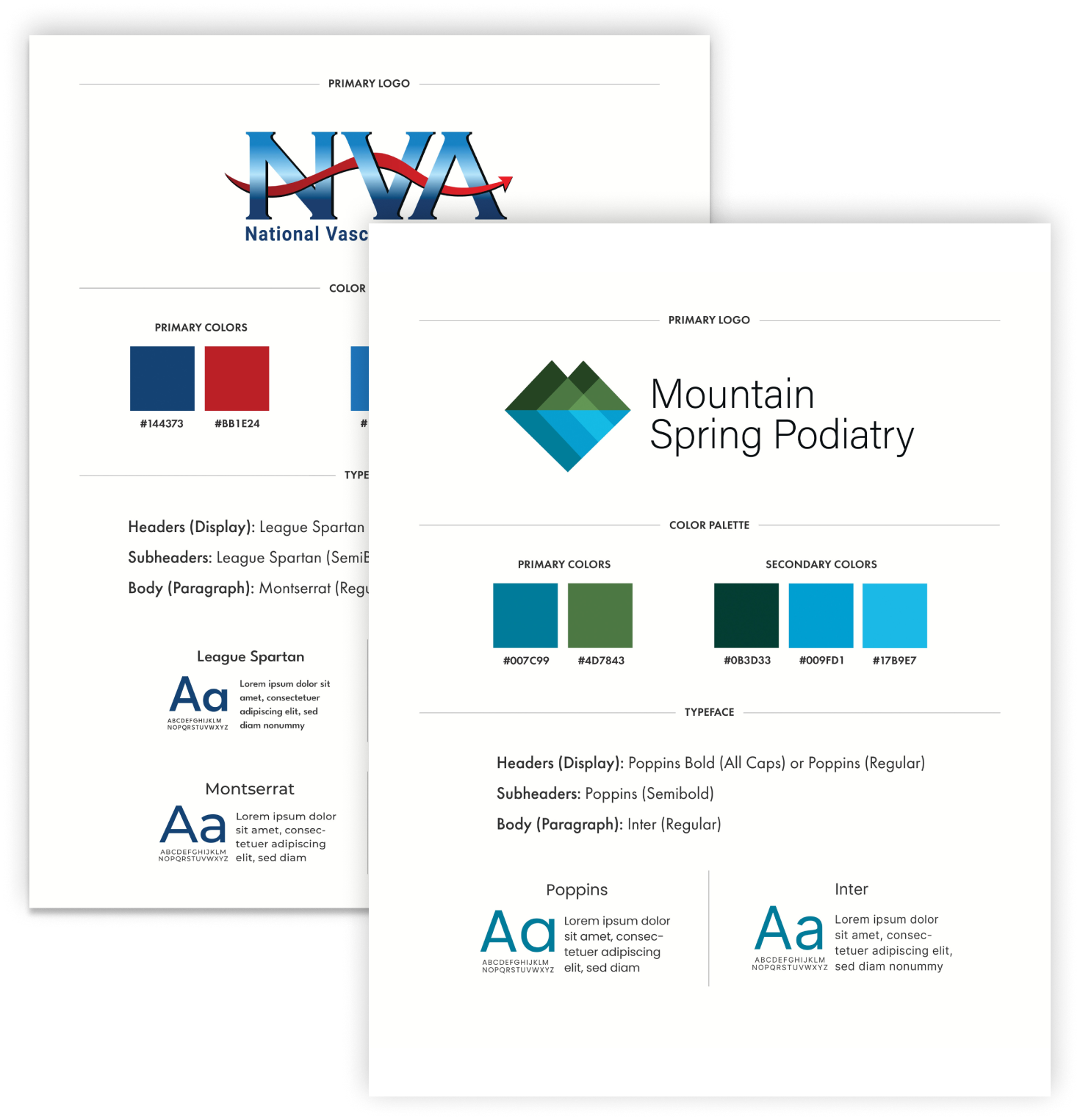
Cohesive Branding
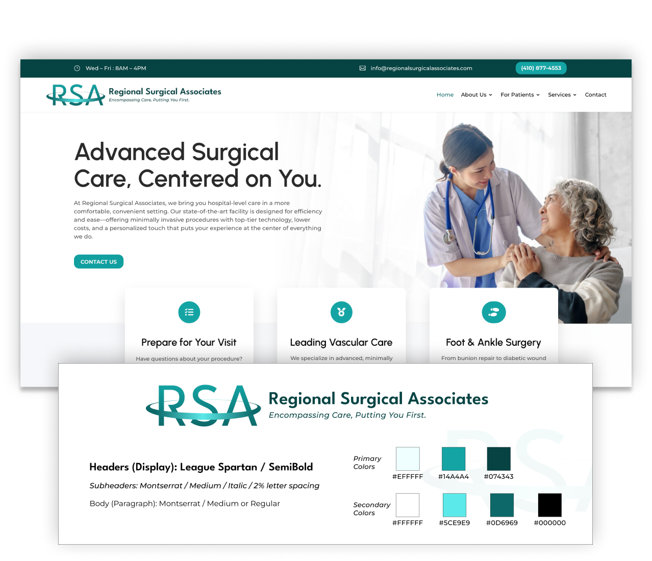
I created a unified style guide that brought consistency across three distinct brand identities, balancing typography, color, and imagery.
This gave patients a recognizable and professional experience no matter which site they visited.
Advocacy & Constraints:
- Some outdated logos were non-negotiable due to executive preference. I harmonized them into the design system without breaking the overall aesthetic.
- I pushed for refreshed imagery and iconography to modernize the look while respecting existing brand equities.
AI-Assisted Workflow
To accelerate research and content creation under tight deadlines, I used ChatGPT and other AI tools to:
- Quickly analyze competitive sites and synthesize takeaways.
- Draft patient personas rooted in referral and demographic data.
- Generate first-pass content (e.g., FAQs, service descriptions), which I then edited for accuracy and patient readability.
Impact:
This allowed me to spend more time on design decisions while still grounding the work in user and business needs.
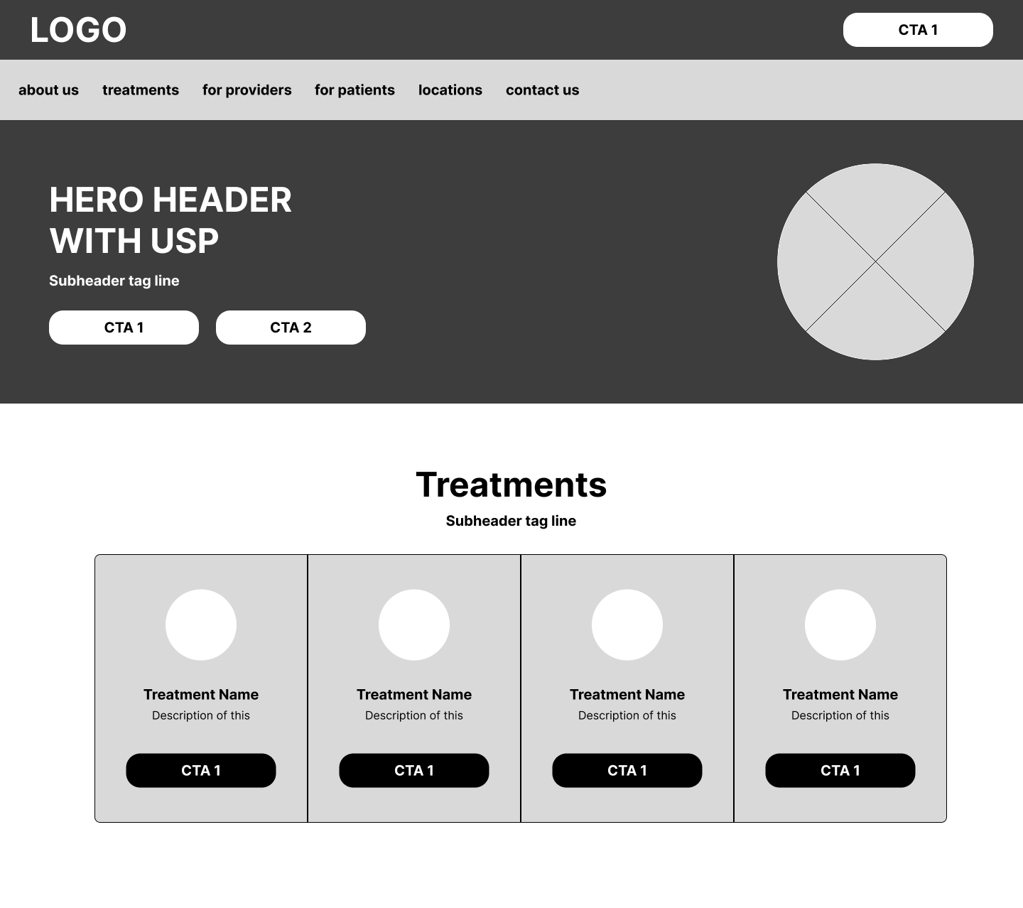
Rapid Wireframing & UI Design
Using Figma, I developed low- and high-fidelity wireframes to refine user flows, then translated them into polished UI mockups that balanced clinical credibility with patient accessibility.
Advocacy & Constraints
- Information architecture was partially influenced by physician requests, which required blending medical-preferred categorizations with patient-friendly language.
- I made strategic compromises in navigation structure while ensuring “Schedule Appointment” remained a clear, universal CTA.
User-Centered Design & Strategy
Even without formal usability testing, I grounded design decisions in patient needs gathered from internal insights and front-office staff.
- Simplified appointment flows for caregivers and older adults.
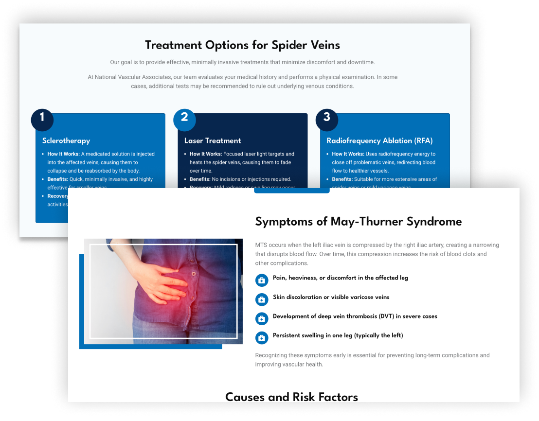
- Used plain-language explanations for complex conditions.
- Added visible trust markers like physician bios, certifications, and procedure clarity.
Advocacy & Constraints:
- I worked with medical staff to edit content so it was accurate and patient-friendly — a careful balance that required negotiation.
Accessibility & Compliance
From the start, I designed with WCAG 2.0 AA standards in mind: clear contrast, scalable typography, and keyboard-friendly navigation.
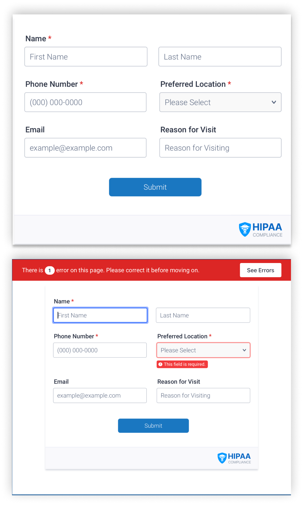
I also advocated for secure, HIPAA-compliant forms to replace outdated contact pages.
These forms gave patients a trustworthy way to submit sensitive information.
Advocacy & Constraints:
- Implementation required pushing past initial resistance, but HIPAA compliance was ultimately adopted.
- Patient intake staff confirmed the new system improved efficiency and reduced incomplete forms.
Scalable Design Systems
I established a modular framework so that future service pages, locations, and campaigns could be added without breaking consistency.
- This reduced long-term maintenance costs and kept the patient experience uniform.
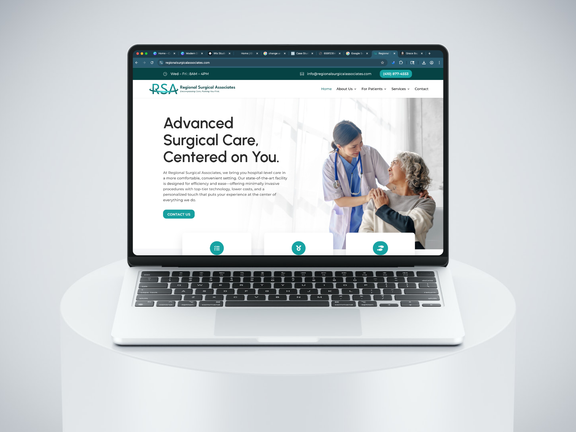
- The same design systems with slight modifications for branding was able to be used in building future sites, such as Regional Surgical Associates.
Advocacy & Constraints:
- Full rollout of the design system was limited by timeline, but I documented patterns for future use.
- The system allowed for flexible application across three different brand visual identities, proving its adaptability.
Improved User Experience with Intuitive Layouts
The final results included two website redesigns as well as another completely new brand and website. Being able to define the UX guidelines and expectations for this design work enabled me to establish a team of designers that were able to be follow clear direction, challenge ideas, and bring user-centered creativity to a traditionally complex field.
The supporting pages also followed the same standards of consistency and visual hierarchy, creating a more readable site for information-seeking and an intuitive experience for all patients and providers.
Key Outcomes
168% Increase
in monthly site visitors within 3 months of launched website redesigns.
400%
in appointment requests submitted through website forms each month.
106% Increase
in monthly number of new patients within four months of launching redesigns.
How did I use graphic & print design to support integrated marketing?
Cohesive Branding
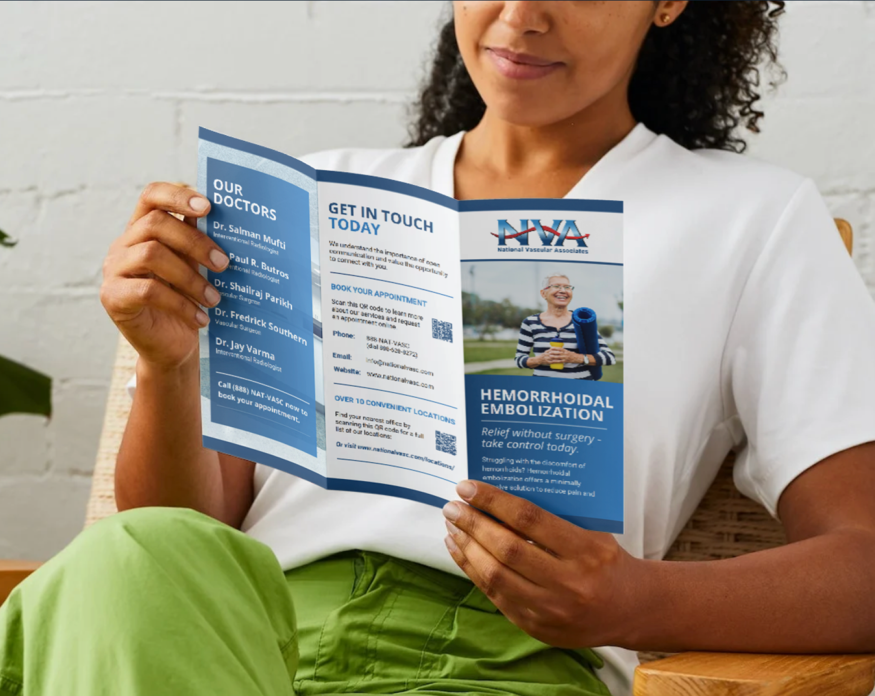
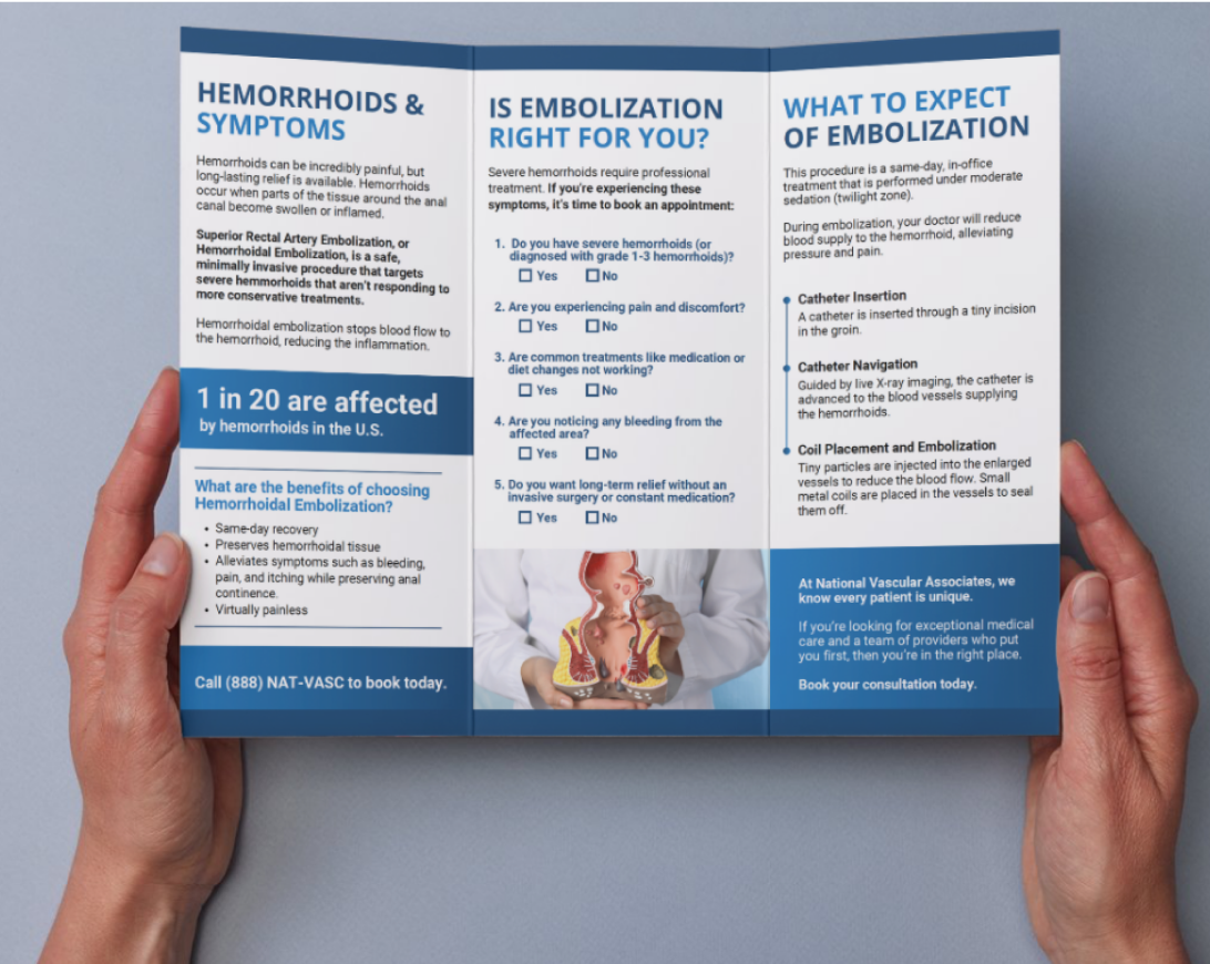
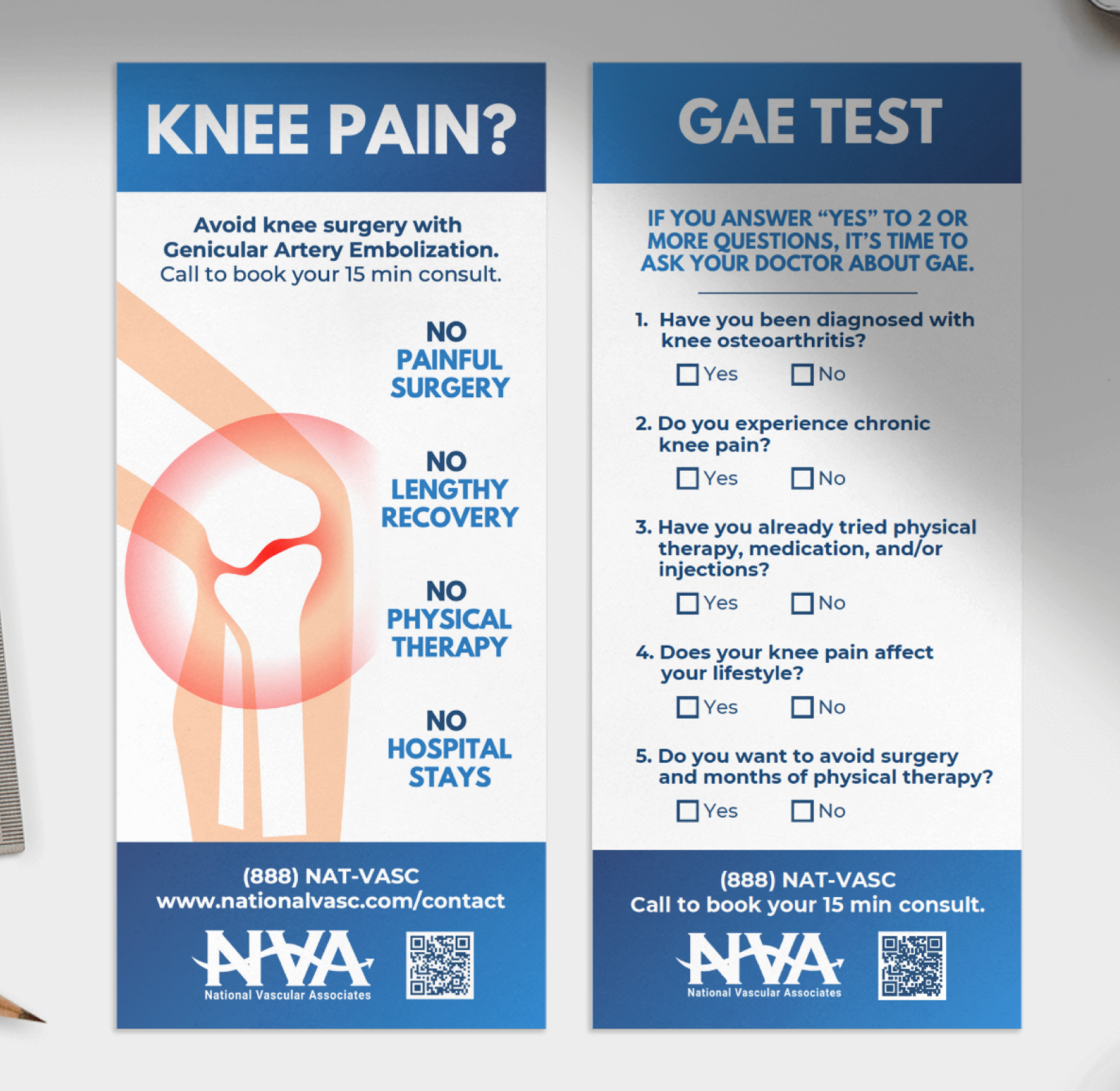
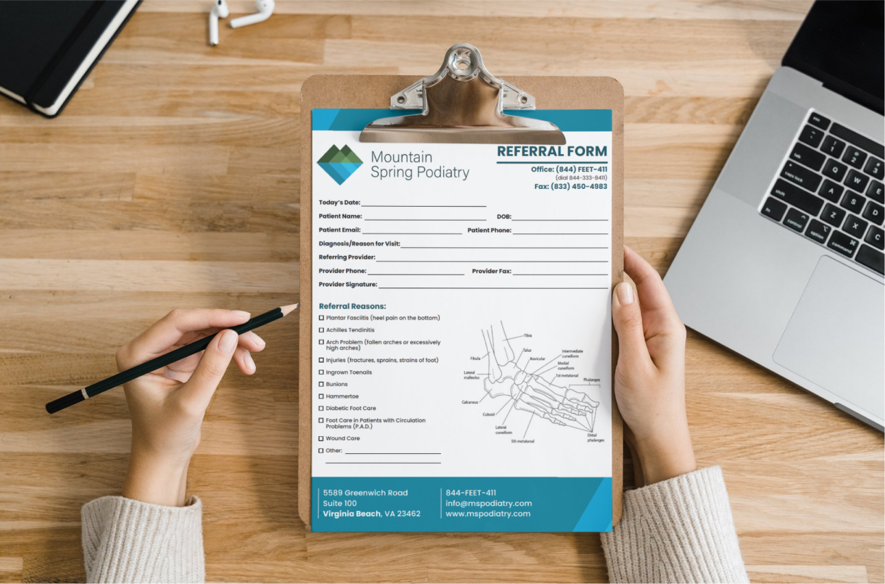
Using the established branding guidelines and asset libraries, I created a series of templates for social media, brochures, event flyers, emails, and more.
Accurate & Engaging Content
In this role, I also acted as a content designer, copywriter, editor, and UX writer. With such highly specific subject matter in the medical field, it was imperative that I created content with care and accuracy to avoid health misinformation.
Print Designs
Social Media Graphics
Using Design to Engage Patients
UX/UI Design | Branding | Healthcare | Design Systems | Digital Marketing
Creating accessible, patient-centered websites that better reflected healthcare services, increased patient acquisition through digital leads, and aligned the design system across all digital touchpoints.
Overview
As Director of Marketing Operations, I led the full redesign and rebuild of Mountain Spring Vascular’s digital presence, including two major site overhauls and the creation of two new sites from the ground up. Working with limited time and resources, I applied UI/UX research and design principles to make the sites more accessible, patient-friendly, and aligned with business growth goals.
Within three months of launch, the redesigns delivered measurable results (below).
Please note that certain details have been limited due to a non-disclosure agreement (NDA). If you have specific questions and are interested in learning more about how I approach healthcare UX, please reach out to me.
Role
UX Researcher & Designer | MarTech Manager | Project Manager
Client
Mountain Spring Vascular (4 brands under multi-specialty group)
Jump to

Key Outcomes
168% Increase
in monthly site visitors within 3 months of launched website redesigns.
400%
in appointment requests submitted through website forms each month.
106% Increase
in monthly number of new patients within four months of launching redesigns.
How did I turn a business goal into a project brief?
Business Goals
01. Increase revenue with increased number of new patients each month
02. Support opening of new office locations by prioritizing digital marketing
The existing sites were fragmented and outdated, with inconsistent branding, confusing navigation, and patient forms that failed to meet HIPAA standards.
Patients — many of whom were older adults or caregivers — struggled to find the information they needed quickly.
At the same time, leadership wanted to accelerate growth and increase lead capture.
My goals were to address the major security and HIPAA issues, and launching website redesigns with a solid branding package and core pages ready. The second stage of this project allowed for the full buildout of the website informational pages as well as creating the supplemental print materials.
How did I establish a data-driven direction?
With no time for formal usability testing, I conducted rapid, scrappy research to understand user needs:
- Competitive Analysis: Comparing aspects of regional vascular and podiatry practices revealed clearer pathways to appointments and stronger trust-building cues.
- Quick Interviews: I sought short, informal interviews from clinical staff and operations staff to understand some of the pain points they noticed.
- In-Office Observation: Based on observing the waiting room, the primary users were older patients or caregivers seeking trustworthy, professional care with minimal friction.
- Data Analysis: I found relevant demographic data in the EHR (electronic health record) and supplemented lacking areas with open-source data from the CDC, Medicare.Gov, and regional health data sets from UVA.
These findings guided 3 design priorities:
01.
Accessibility and responsiveness were vital. Our users tended to be older adults or caregivers who used smart phones with increased text size, so WCAG-compliant typography, contrast, plain language, and clear breakpoints were necessary.
02.
Simplified user flows with clear calls to action for requesting online appointments, paying bills, signing in to the online patient portal, getting directions, and calling the office. This also included better form design for submitting an appointment request.
03.
Visible trust signals, including provider credentials on the front page, HIPAA-compliant badge on the forms, linked Google business profiles, and clear language.
Current Issues
Inconsistent visuals and branding
Unoptimized navigation for patient users
Lack of digital HIPAA compliance
Lack of accessibility and responsive sizing
Project Constraints
Inconsistent visuals and branding
Unoptimized navigation for patient users
Lack of digital HIPAA compliance
Lack of accessibility and responsive sizing

How did I use design to meet these goals?
Cohesive Branding
I created a unified style guide that brought consistency across three distinct brand identities, balancing typography, color, and imagery.
This gave patients a recognizable and professional experience no matter which site they visited.
Advocacy & Constraints:
- Some outdated logos were non-negotiable due to executive preference. I harmonized them into the design system without breaking the overall aesthetic.
- I pushed for refreshed imagery and iconography to modernize the look while respecting existing brand equities.
AI-Assisted Workflow
To accelerate research and content creation under tight deadlines, I used ChatGPT and other AI tools to:
- Quickly analyze competitive sites and synthesize takeaways.
- Draft patient personas rooted in referral and demographic data.
- Generate first-pass content (e.g., FAQs, service descriptions), which I then edited for accuracy and patient readability.
Impact:
This allowed me to spend more time on design decisions while still grounding the work in user and business needs.
Rapid Wireframing & UI Design
Using Figma, I developed low- and high-fidelity wireframes to refine user flows, then translated them into polished UI mockups that balanced clinical credibility with patient accessibility.
Advocacy & Constraints
- Information architecture was partially influenced by physician requests, which required blending medical-preferred categorizations with patient-friendly language.
- I made strategic compromises in navigation structure while ensuring “Schedule Appointment” remained a clear, universal CTA.
User-Centered Design & Strategy
Even without formal usability testing, I grounded design decisions in patient needs gathered from internal insights and front-office staff.
- Simplified appointment flows for caregivers and older adults.
- Used plain-language explanations for complex conditions.
- Added visible trust markers like physician bios, certifications, and procedure clarity.
Advocacy & Constraints:
- I worked with medical staff to edit content so it was accurate and patient-friendly — a careful balance that required negotiation.
Accessibility & Compliance
From the start, I designed with WCAG 2.0 AA standards in mind: clear contrast, scalable typography, and keyboard-friendly navigation.
I also advocated for secure, HIPAA-compliant forms to replace outdated contact pages.
These forms gave patients a trustworthy way to submit sensitive information.
Advocacy & Constraints:
- Implementation required pushing past initial resistance, but HIPAA compliance was ultimately adopted.
- Patient intake staff confirmed the new system improved efficiency and reduced incomplete forms.
Scalable Design Systems
I established a modular framework so that future service pages, locations, and campaigns could be added without breaking consistency.
- This reduced long-term maintenance costs and kept the patient experience uniform.
- The same design systems with slight modifications for branding was able to be used in building future sites, such as Regional Surgical Associates.
Advocacy & Constraints:
- Full rollout of the design system was limited by timeline, but I documented patterns for future use.
- The system allowed for flexible application across three different brand visual identities, proving its adaptability.
Improved User Experience with Intuitive Layouts
The final results included two website redesigns as well as another completely new brand and website. Being able to define the UX guidelines and expectations for this design work enabled me to establish a team of designers that were able to be follow clear direction, challenge ideas, and bring user-centered creativity to a traditionally complex field.
The supporting pages also followed the same standards of consistency and visual hierarchy, creating a more readable site for information-seeking and an intuitive experience for all patients and providers.
Key Outcomes
168% Increase
in monthly site visitors within 3 months of launched website redesigns.
400%
in appointment requests submitted through website forms each month.
106% Increase
in monthly number of new patients within four months of launching redesigns.
How did I use graphic & print design to support integrated marketing?
Cohesive Branding
Using the established branding guidelines and asset libraries, I created a series of templates for social media, brochures, event flyers, emails, and more.
Accurate & Engaging Content
In this role, I also acted as a content designer, copywriter, editor, and UX writer. With such highly specific subject matter in the medical field, it was imperative that I created content with care and accuracy to avoid health misinformation.
Print Designs
Social Media Graphics
Using Design to Engage Patients
UX/UI Design | Branding | Healthcare | Design Systems | Digital Marketing
Creating accessible, patient-centered websites that better reflected healthcare services, increased patient acquisition through digital leads, and aligned the design system across all digital touchpoints.
Overview
As Director of Marketing Operations, I led the full redesign and rebuild of Mountain Spring Vascular’s digital presence, including two major site overhauls and the creation of two new sites from the ground up. Working with limited time and resources, I applied UI/UX research and design principles to make the sites more accessible, patient-friendly, and aligned with business growth goals.
Within three months of launch, the redesigns delivered measurable results (below).
Please note that certain details have been limited due to a non-disclosure agreement (NDA). If you have specific questions and are interested in learning more about how I approach healthcare UX, please reach out to me.
Role
UX Researcher & Designer | MarTech Manager | Project Manager
Client
Mountain Spring Vascular (4 brands under multi-specialty group)
Jump to

Key Outcomes
168% Increase
in monthly site visitors within 3 months of launched website redesigns.
400% Increase
in appointment requests submitted through website forms each month.
106% Increase
in monthly number of new patients within four months of launching redesigns.
How did I turn a business goal into a project brief?
Business Goals
01. Increase revenue with increased number of new patients each month
02. Support opening of new office locations by prioritizing digital marketing
The existing sites were fragmented and outdated, with inconsistent branding, confusing navigation, and patient forms that failed to meet HIPAA standards.
Patients — many of whom were older adults or caregivers — struggled to find the information they needed quickly.
At the same time, leadership wanted to accelerate growth and increase lead capture.
My goals were to address the major security and HIPAA issues, and launching website redesigns with a solid branding package and core pages ready. The second stage of this project allowed for the full buildout of the website informational pages as well as creating the supplemental print materials.
How did I establish a data-driven direction?
With no time for formal usability testing, I conducted rapid, scrappy research to understand user needs:
- Competitive Analysis: Comparing aspects of regional vascular and podiatry practices revealed clearer pathways to appointments and stronger trust-building cues.
- Quick Interviews: I sought short, informal interviews from clinical staff and operations staff to understand some of the pain points they noticed.
- In-Office Observation: Based on observing the waiting room, the primary users were older patients or caregivers seeking trustworthy, professional care with minimal friction.
- Data Analysis: I found relevant demographic data in the EHR (electronic health record) and supplemented lacking areas with open-source data from the CDC, Medicare.Gov, and regional health data sets from UVA.
These findings guided 3 design priorities:
01.
Accessibility and responsiveness were vital. Our users tended to be older adults or caregivers who used smart phones with increased text size, so WCAG-compliant typography, contrast, plain language, and clear breakpoints were necessary.
02.
Simplified user flows with clear calls to action for requesting online appointments, paying bills, signing in to the online patient portal, getting directions, and calling the office. This also included better form design for submitting an appointment request.
03.
Visible trust signals, including provider credentials on the front page, HIPAA-compliant badge on the forms, linked Google business profiles, and clear language.
Current Issues
Inconsistent visuals and branding
Unoptimized navigation for patient users
Lack of digital HIPAA compliance
Lack of accessibility and responsive sizing
Project Constraints
Limited timeline and budget for project rollout
Lack of research/testing opportunities with users
Leadership requirements to retain certain designs
Little to no content retained from existing site (legal issues)

How did I use design to meet these goals?
Cohesive Branding
I created a unified style guide that brought consistency across three distinct brand identities, balancing typography, color, and imagery.
This gave patients a recognizable and professional experience no matter which site they visited.
Advocacy & Constraints:
- Some outdated logos were non-negotiable due to executive preference. I harmonized them into the design system without breaking the overall aesthetic.
- I pushed for refreshed imagery and iconography to modernize the look while respecting existing brand equities.
AI-Assisted Workflow
To accelerate research and content creation under tight deadlines, I used ChatGPT and other AI tools to:
- Quickly analyze competitive sites and synthesize takeaways.
- Draft patient personas rooted in referral and demographic data.
- Generate first-pass content (e.g., FAQs, service descriptions), which I then edited for accuracy and patient readability.
Impact:
This allowed me to spend more time on design decisions while still grounding the work in user and business needs.
Rapid Wireframing & UI Design
Using Figma, I developed low- and high-fidelity wireframes to refine user flows, then translated them into polished UI mockups that balanced clinical credibility with patient accessibility.
Advocacy & Constraints
- Information architecture was partially influenced by physician requests, which required blending medical-preferred categorizations with patient-friendly language.
- I made strategic compromises in navigation structure while ensuring “Schedule Appointment” remained a clear, universal CTA.
User-Centered Design & Strategy
Even without formal usability testing, I grounded design decisions in patient needs gathered from internal insights and front-office staff.
- Simplified appointment flows for caregivers and older adults.
- Used plain-language explanations for complex conditions.
- Added visible trust markers like physician bios, certifications, and procedure clarity.
Advocacy & Constraints:
- I worked with medical staff to edit content so it was accurate and patient-friendly — a careful balance that required negotiation.
Accessibility & Compliance
From the start, I designed with WCAG 2.0 AA standards in mind: clear contrast, scalable typography, and keyboard-friendly navigation.
I also advocated for secure, HIPAA-compliant forms to replace outdated contact pages.
These forms gave patients a trustworthy way to submit sensitive information.
Advocacy & Constraints:
- Implementation required pushing past initial resistance, but HIPAA compliance was ultimately adopted.
- Patient intake staff confirmed the new system improved efficiency and reduced incomplete forms.
Scalable Design Systems
I established a modular framework so that future service pages, locations, and campaigns could be added without breaking consistency.
- This reduced long-term maintenance costs and kept the patient experience uniform.
- The same design systems with slight modifications for branding was able to be used in building future sites, such as Regional Surgical Associates.
Advocacy & Constraints:
- Full rollout of the design system was limited by timeline, but I documented patterns for future use.
- The system allowed for flexible application across three different brand visual identities, proving its adaptability.
Improved User Experience with Intuitive Layouts
The final results included two website redesigns as well as another completely new brand and website. Being able to define the UX guidelines and expectations for this design work enabled me to establish a team of designers that were able to be follow clear direction, challenge ideas, and bring user-centered creativity to a traditionally complex field.
The supporting pages also followed the same standards of consistency and visual hierarchy, creating a more readable site for information-seeking and an intuitive experience for all patients and providers.
Key Outcomes
168% Increase
in monthly site visitors within 3 months of launched website redesigns.
400% Increase
in appointment requests submitted through website forms each month.
106% Increase
in monthly number of new patients within four months of launching redesigns.
How did I use graphic & print design to support integrated marketing?
Cohesive Branding
Using the established branding guidelines and asset libraries, I created a series of templates for social media, brochures, event flyers, emails, and more.
Accurate & Engaging Content
In this role, I also acted as a content designer, copywriter, editor, and UX writer. With such highly specific subject matter in the medical field, it was imperative that I created content with care and accuracy to avoid health misinformation.
Print Designs
Social Media Graphics