
GrowWell: A Better Way to Manage Diabetes
Product Design | UX Research | Health Tech | Personal Health Informatics
An app designed from the first idea to final prototype, focused on increasing adoption and adherence for older adult users.
Overview
I created a personal health informatics application focused on helping older adults utilize digital tracking to manage diabetes as they grow into older age. There is currently a lack of applications for adults with diabetes that focus specifically on the needs of older adults and aging in tech. I designed this app with the goals of overcoming barriers to tracking adoption, lowering data capture burdens, and increasing adherence to data tracking over time.
Role
UX Designer & Researcher | Project Manager | Team of 4
Project
Course Project during Master’s of Human-Computer Interaction
What sets GrowWell apart?
Designed specifically for older adults with diabetes
I utilized design guidelines and WCAG guidelines specific to the needs of older adults. I also honed in on user needs through research and implementing user feedback.
Actively addressed barriers to adoption
I provided tutorials and a simple onboarding process, as well as tailored the tracking elements and process to the user's needs. I also lowered the data capture burden by designing multimodal input.
Tailored to encourage long-term adherence
I lowered the user's memory burden by providing returnable tutorials, and I encouraged users with positive framing and feedback.

How did I turn ambiguity into a project direction?
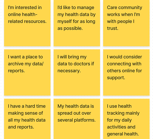
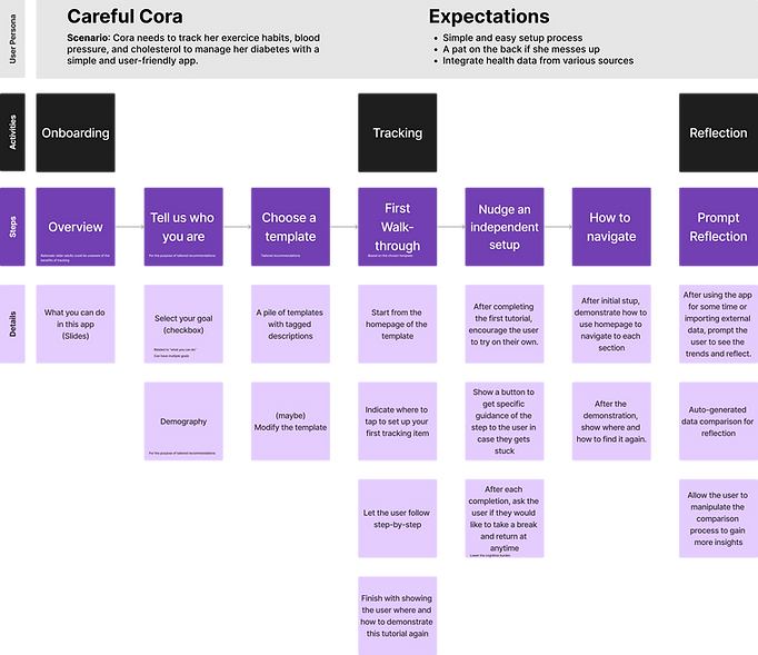
I always start with research. I was initially interested in how older adults with long term health issues handle their disease management with the aid of informal care communities. My first round of research included reviews of scholarly research papers and comparison of relevant health tracking apps to gain current insights. Then, I conducted remote interviews with 5 older adult users (55-85 years old) to hone in on how our target users approach health management and their attitudes toward digital health tracking.
I used the resulting qualitative data to draw insights through an affinity diagram, which showed our team that the target users were concerned with flexibility and autonomy in digital health tracking.
Our team had the opportunity to receive feedback on our low-fidelity prototypes through a class critique session.
Our key ideas at this point included the onboarding process, increased data access, health tracking templates, data visualization, and a social forum component. The feedback we received was to narrow our scope and dive deeper.
How did I get to know our target users?
I conducted another round of remote interviews with two older adult users who have chronic illness.
From this research, our team decided to narrow the target audience to be only older adult users with diabetes. Targeting more than one chronic illness was too large to do well considering our project timeline.
"If it was just click, click, click - easy!""What was the situation at the time?...If there's a pattern, then I have proof."
- Interested in digital health tracking - but only if it was easier for her than paper tracking
- Liked the idea of tracking context
- Liked having long-term data tracking as a personal health record
"If you have a good experience setting it up, you feel confident!...If setting up is a pain, your reaction is 'Why did I get this?' . Setup should be 51% of the app. I want to feel like 'Ok, I'm ready to go!' "
- Liked digital health trackers but is very selective based on data capture burden and app flexibility
- Motivated by goal-setting, positive framing, and reflection
- Stressed the importance of setup (onboarding) in affecting the perception of the tracking device
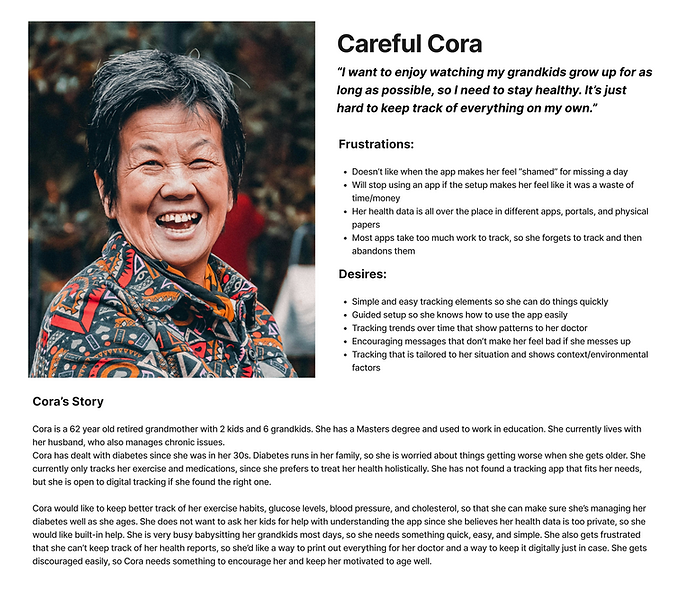
User Persona
Updated Designs
How did I tailor our app for our target users’ needs?
Our next step was creating a lo-fi prototype that took into account the latest feedback. I worked on incorporating the following elements for this iteration
Simplified onboarding and tracking process
This included standardizing tracking screens as much as possible, while still maintaining the variety of tracking features.
Built a set of tutorials nested in a help center
This allowed users with memory issues or low tech literacy to feel more confident in using the app on their own.
Lowered user's manual data capture burden
I did this by incorporating semi-automatic tracking as well as including options for multimodal input.
Increased data access and download options
Different methods for sharing and accessing longterm health data allows the users to use our app as a personal health record.
Encouraged reflection on data tracking
Reflection is key to behavior change, so we created data visualizations that are easily digested for user reflection.
Revised interface based on WCAG 2.1
Since we narrowed down our target users, I took the initiative to make our app accessible based on WCAG 2.1 guidelines.
Utilized behavior change psychology tools
Positive framing in user feedback cycles is a helpful psychological tool that I implemented here to keep our users feeling motivated.
Implemented tracking for contextual factors
Contextual factors were a key point in our research, so I incorporated different trackable factors based on the user's goal.
How did I evaluate our work?
I conducted two in-person usability testing sessions to evaluate our low-fidelity prototypes prior to the high-fidelity stage. Due to time constraints, I was unable to find older adult users with diabetes.
We had two older adult participants (between 65-85 years old) with chronic health concerns. One participant was male, and one was female.
Each user was asked to complete five tasks while thinking out loud. Each task took them through the different areas of our low-fidelity prototype (Onboarding, Data Export, Visualizations, Tracking, and Home/Help Center).
Areas of Positive Feedback
- Onboarding process
- Multimodal input
- Speech, image, and text
- Semiautomatic tracking
- Data integration
- Positive framing
Areas for Improvement
- Tutorial screen overlay
- Too dark
- Confusing tutorial call-outs
- Progress indicator
- Data comparison to goals
- Data clarity
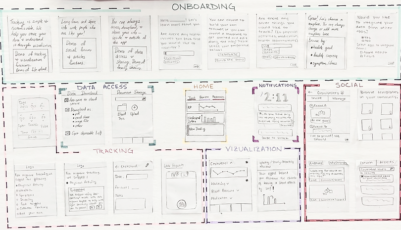
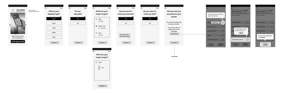
Lo-Fi Wireframes Onboarding Flow
How did I turn research insights into design solutions?
Lightening the tutorial screens
To address the dark tutorial screens that were hard for older adult users to see, I utilized a lighter overlay for tutorials and added in color-based call outs in the tutorials. While less visually appealing, it proved to be more helpful for our target users.
Adding visual progress
Easily overlooked but vitally important, I added a progress bar in the onboarding screens to let users know how close they are to starting their tracking journey. This helps in keeping users motivated while setting up their accounts and tracking preferences.
Comparing data to goals
I improved the home screen visualizations to show the user's daily statistics and average data (averages over time) in comparison to their preset goals. This allows them to see their progress in relation to their long term goals.
Increasing data clarity
I simplified the blood glucose data visualizations for easier interpretation and created multiple views that allow users to view time-based data differently. I also added basic tutorials to support new users in understanding data visualizations.
How did the final iteration meet our design goals and our user needs?
Addressing Barriers to Adoption
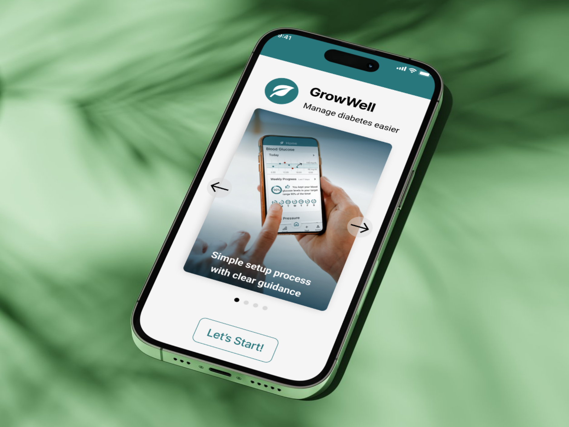
Onboarding & Guidance
When using the app for the first time, the onboarding process is clear, straightforward, and addresses some of the key tracking indicators. We follow the onboarding immediately with a short guide through the app.
Help Center & Tech Literacy
It was important that we didn’t assume the level of tech literacy of any of our users, so the guides can always be revisited in the help center.
We were careful to make language clear and simple, so if the users wanted to skip through the tutorials or didn’t need the help center, they would feel comfortable as well.
Addressing Adherence with Data Capture Burden
Semi-Automation & Data Capture
We included a simple tracking tutorial for the first time they open the app.
This also indicates which elements can be linked to external data collectors, which reduces the data capture burden with semi-automation.
For example, this app would be compatible with Blood Glucose monitors, Apple Watches/Garmin/FitBit, smart weight scales, and smart food scales/food tracking apps.
Multimodal Data Capture
Some users seemed to prefer a level of interaction required for tracking as it kept them invested, so they historically preferred pen and paper.
For these users, we wanted to make sure that they had the option to enter their info easily depending on their mood, so they can add in data entries for any of the categories in three different modalities.
This includes voice capture, text notes, and photo capture.
Understanding Data Visualizations
Motivation & Accuracy
These data visualizations expand on the summary versions displayed on the home screen.
For users who like to dig into their progress to stay motivated, I wanted to design an aspect of data visualizations that felt more in-depth and insightful without sacrificing readability.
Our team was careful when designing blood glucose visualizations, as it can be a difficult type of data to accurately portray due to the time-sensitivity and potential for serious repercussions.
Tracking as a Health Record
Exporting Data
Our users are able to export their tracking information with ease. This ability was important to our team as it addressed a long-standing concern with our users, who said:
"What was the situation at the time?...If there's a pattern, then I have proof."
To address this need, the data can be exported via email or printable pdf.
Patient Self-Advocacy
While data export seems like a simple feature, this ability to export in a readable format makes all the difference for our users as it gives the app a deeper purpose of assisting in patient self-advocacy.
Having biometric data can assist patients who feel unheard or concerned about symptoms that might not surface during a 15-min doctor visit.
GrowWell: A Better Way to Manage Diabetes
Product Design | UX Research | Health Tech | Personal Health Informatics
An app designed from the first idea to final prototype, focused on increasing adoption and adherence for older adult users.
Overview
I created a personal health informatics application focused on helping older adults utilize digital tracking to manage diabetes as they grow into older age. There is currently a lack of applications for adults with diabetes that focus specifically on the needs of older adults and aging in tech. I designed this app with the goals of overcoming barriers to tracking adoption, lowering data capture burdens, and increasing adherence to data tracking over time.
Role
UX Designer & Researcher | Project Manager | Team of 4
Project
Course Project during Master’s of Human-Computer Interaction
What sets GrowWell apart?
Designed specifically for older adults with diabetes
I utilized design guidelines and WCAG guidelines specific to the needs of older adults. I also honed in on user needs through research and implementing user feedback.
Actively addressed barriers to adoption
I provided tutorials and a simple onboarding process, as well as tailored the tracking elements and process to the user's needs. I also lowered the data capture burden by designing multimodal input.
Tailored to encourage long-term adherence
I lowered the user's memory burden by providing returnable tutorials, and I encouraged users with positive framing and feedback.

How did I turn ambiguity into a project direction?
I always start with research. I was initially interested in how older adults with long term health issues handle their disease management with the aid of informal care communities. My first round of research included reviews of scholarly research papers and comparison of relevant health tracking apps to gain current insights. Then, I conducted remote interviews with 5 older adult users (55-85 years old) to hone in on how our target users approach health management and their attitudes toward digital health tracking.
I used the resulting qualitative data to draw insights through an affinity diagram, which showed our team that the target users were concerned with flexibility and autonomy in digital health tracking.
Our team had the opportunity to receive feedback on our low-fidelity prototypes through a class critique session.
Our key ideas at this point included the onboarding process, increased data access, health tracking templates, data visualization, and a social forum component. The feedback we received was to narrow our scope and dive deeper.
How did I get to know our target users?
I conducted another round of remote interviews with two older adult users who have chronic illness.
From this research, our team decided to narrow the target audience to be only older adult users with diabetes. Targeting more than one chronic illness was too large to do well considering our project timeline.
"If it was just click, click, click - easy!""What was the situation at the time?...If there's a pattern, then I have proof."
- Interested in digital health tracking - but only if it was easier for her than paper tracking
- Liked the idea of tracking context
- Liked having long-term data tracking as a personal health record
"If you have a good experience setting it up, you feel confident!...If setting up is a pain, your reaction is 'Why did I get this?' . Setup should be 51% of the app. I want to feel like 'Ok, I'm ready to go!' "
- Liked digital health trackers but is very selective based on data capture burden and app flexibility
- Motivated by goal-setting, positive framing, and reflection
- Stressed the importance of setup (onboarding) in affecting the perception of the tracking device
User Persona
Updated Designs
How did I tailor our app for our target users’ needs?
Our next step was creating a lo-fi prototype that took into account the latest feedback. I worked on incorporating the following elements for this iteration
Simplified onboarding and tracking process
This included standardizing tracking screens as much as possible, while still maintaining the variety of tracking features.
Built a set of tutorials nested in a help center
This allowed users with memory issues or low tech literacy to feel more confident in using the app on their own.
Lowered user's manual data capture burden
I did this by incorporating semi-automatic tracking as well as including options for multimodal input.
Increased data access and download options
Different methods for sharing and accessing longterm health data allows the users to use our app as a personal health record.
Encouraged reflection on data tracking
Reflection is key to behavior change, so we created data visualizations that are easily digested for user reflection.
Revised interface based on
WCAG 2.1
Since we narrowed down our target users, I took the initiative to make our app accessible based on WCAG 2.1 guidelines.
Utilized behavior change psychology tools
Positive framing in user feedback cycles is a helpful psychological tool that I implemented here to keep our users feeling motivated.
Implemented tracking for contextual factors
Contextual factors were a key point in our research, so I incorporated different trackable factors based on the user's goal.
How did I evaluate our work?
I conducted two in-person usability testing sessions to evaluate our low-fidelity prototypes prior to the high-fidelity stage. Due to time constraints, I was unable to find older adult users with diabetes.
We had two older adult participants (between 65-85 years old) with chronic health concerns. One participant was male, and one was female.
Each user was asked to complete five tasks while thinking out loud. Each task took them through the different areas of our low-fidelity prototype (Onboarding, Data Export, Visualizations, Tracking, and Home/Help Center).
Areas of Positive Feedback
- Onboarding process
- Multimodal input
- Speech, image, and text
- Semiautomatic tracking
- Data integration
- Positive framing
Areas for Improvement
- Tutorial screen overlay
- Too dark
- Confusing tutorial call-outs
- Progress indicator
- Data comparison to goals
- Data clarity
Lo-Fi Wireframes Onboarding Flow
How did I turn research insights into design solutions?
Lightening the tutorial screens
To address the dark tutorial screens that were hard for older adult users to see, I utilized a lighter overlay for tutorials and added in color-based call outs in the tutorials. While less visually appealing, it proved to be more helpful for our target users.
Adding visual progress
Easily overlooked but vitally important, I added a progress bar in the onboarding screens to let users know how close they are to starting their tracking journey. This helps in keeping users motivated while setting up their accounts and tracking preferences.
Comparing data to goals
I improved the home screen visualizations to show the user's daily statistics and average data (averages over time) in comparison to their preset goals. This allows them to see their progress in relation to their long term goals.
Increasing data clarity
I simplified the blood glucose data visualizations for easier interpretation and created multiple views that allow users to view time-based data differently. I also added basic tutorials to support new users in understanding data visualizations.
How did the final iteration meet our design goals and our user needs?
Addressing Barriers to Adoption
Onboarding & Guidance
When using the app for the first time, the onboarding process is clear, straightforward, and addresses some of the key tracking indicators. We follow the onboarding immediately with a short guide through the app.
Help Center & Tech Literacy
It was important that we didn’t assume the level of tech literacy of any of our users, so the guides can always be revisited in the help center.
We were careful to make language clear and simple, so if the users wanted to skip through the tutorials or didn’t need the help center, they would feel comfortable as well.
Addressing Adherence with Data Capture Burden
Semi-Automation & Data Capture
We included a simple tracking tutorial for the first time they open the app. This also indicates which elements can be linked to external data collectors, which reduces the data capture burden with semi-automation.
For example, this app would be compatible with Blood Glucose monitors, Apple Watches/Garmin/FitBit, smart weight scales, and smart food scales/food tracking apps.
Multimodal Data Capture
Some users seemed to prefer a level of interaction required for tracking as it kept them invested, so they historically preferred pen and paper.
For these users, we wanted to make sure that they had the option to enter their info easily depending on their mood, so they can add in data entries for any of the categories in three different modalities. This includes voice capture, text notes, and photo capture.
Understanding Data Visualizations
Motivation & Accuracy
These data visualizations expand on the summary versions displayed on the home screen.
For users who like to dig into their progress to stay motivated, I wanted to design an aspect of data visualizations that felt more in-depth and insightful without sacrificing readability.
Our team was careful when designing blood glucose visualizations, as it can be a difficult type of data to accurately portray due to the time-sensitivity and potential for serious repercussions.
Tracking as a Health Record
Exporting Data
Our users are able to export their tracking information with ease. This ability was important to our team as it addressed a long-standing concern with our users, who said:
"What was the situation at the time?...If there's a pattern, then I have proof."
To address this need, the data can be exported via email or printable pdf.
Patient Self-Advocacy
While data export seems like a simple feature, this ability to export in a readable format makes all the difference for our users as it gives the app a deeper purpose of assisting in patient self-advocacy.
Having biometric data can assist patients who feel unheard or concerned about symptoms that might not surface during a 15-min doctor visit.
GrowWell: A Better Way to Manage Diabetes
Product Design | UX Research | Health Tech | Personal Health Informatics
An app designed from the first idea to final prototype, focused on increasing adoption and adherence for older adult users.
Overview
I created a personal health informatics application focused on helping older adults utilize digital tracking to manage diabetes as they grow into older age. There is currently a lack of applications for adults with diabetes that focus specifically on the needs of older adults and aging in tech. I designed this app with the goals of overcoming barriers to tracking adoption, lowering data capture burdens, and increasing adherence to data tracking over time.
Role
UX Designer & Researcher | Project Manager | Team of 4
Project
Course Project during Master’s of Human-Computer Interaction
What sets GrowWell apart?
Designed specifically for older adults with diabetes
I utilized design guidelines and WCAG guidelines specific to the needs of older adults. I also honed in on user needs through research and implementing user feedback.
Actively addressed barriers to adoption
I provided tutorials and a simple onboarding process, as well as tailored the tracking elements and process to the user's needs. I also lowered the data capture burden by designing multimodal input.
Tailored to encourage long-term adherence
I lowered the user's memory burden by providing returnable tutorials, and I encouraged users with positive framing and feedback.

How did I turn ambiguity into a project direction?
I always start with research. I was initially interested in how older adults with long term health issues handle their disease management with the aid of informal care communities. My first round of research included reviews of scholarly research papers and comparison of relevant health tracking apps to gain current insights. Then, I conducted remote interviews with 5 older adult users (55-85 years old) to hone in on how our target users approach health management and their attitudes toward digital health tracking.
I used the resulting qualitative data to draw insights through an affinity diagram, which showed our team that the target users were concerned with flexibility and autonomy in digital health tracking.
Our team had the opportunity to receive feedback on our low-fidelity prototypes through a class critique session.
Our key ideas at this point included the onboarding process, increased data access, health tracking templates, data visualization, and a social forum component. The feedback we received was to narrow our scope and dive deeper.
How did I get to know our target users?
I conducted another round of remote interviews with two older adult users who have chronic illness.
From this research, our team decided to narrow the target audience to be only older adult users with diabetes. Targeting more than one chronic illness was too large to do well considering our project timeline.
"If it was just click, click, click - easy!""What was the situation at the time?...If there's a pattern, then I have proof."
- Interested in digital health tracking - but only if it was easier for her than paper tracking
- Liked the idea of tracking context
- Liked having long-term data tracking as a personal health record
"If you have a good experience setting it up, you feel confident!...If setting up is a pain, your reaction is 'Why did I get this?' . Setup should be 51% of the app. I want to feel like 'Ok, I'm ready to go!' "
- Liked digital health trackers but is very selective based on data capture burden and app flexibility
- Motivated by goal-setting, positive framing, and reflection
- Stressed the importance of setup (onboarding) in affecting the perception of the tracking device
User Persona
User Journey
How did I tailor our app for our target users’ needs?
Our next step was creating a lo-fi prototype that took into account the latest feedback. I worked on incorporating the following elements for this iteration
Simplified onboarding and tracking process
This included standardizing tracking screens as much as possible, while still maintaining the variety of tracking features.
Built a set of tutorials nested in a help center
This allowed users with memory issues or low tech literacy to feel more confident in using the app on their own.
Lowered user's manual data capture burden
I did this by incorporating semi-automatic tracking as well as including options for multimodal input.
Increased data access and download options
Different methods for sharing and accessing longterm health data allows the users to use our app as a personal health record.
Encouraged reflection on data tracking
Reflection is key to behavior change, so we created data visualizations that are easily digested for user reflection.
Revised interface based on WCAG 2.1
Since we narrowed down our target users, I took the initiative to make our app accessible based on WCAG 2.1 guidelines.
Utilized behavior change psychology tools
Positive framing in user feedback cycles is a helpful psychological tool that I implemented here to keep our users feeling motivated.
Implemented tracking for contextual factors
Contextual factors were a key point in our research, so I incorporated different trackable factors based on the user's goal.
How did I evaluate our work?
I conducted two in-person usability testing sessions to evaluate our low-fidelity prototypes prior to the high-fidelity stage. Due to time constraints, I was unable to find older adult users with diabetes.
We had two older adult participants (between 65-85 years old) with chronic health concerns. One participant was male, and one was female.
Each user was asked to complete five tasks while thinking out loud. Each task took them through the different areas of our low-fidelity prototype (Onboarding, Data Export, Visualizations, Tracking, and Home/Help Center).
Areas of Positive Feedback
- Onboarding process
- Multimodal input
- Speech, image, and text
- Semiautomatic tracking
- Data integration
- Positive framing
Areas for Improvement
- Tutorial screen overlay
- Too dark
- Confusing tutorial call-outs
- Progress indicator
- Data comparison to goals
- Data clarity
Lo-Fi Wireframes Onboarding Flow
How did I turn research insights into design solutions?
Lightening the tutorial screens
To address the dark tutorial screens that were hard for older adult users to see, I utilized a lighter overlay for tutorials and added in color-based call outs in the tutorials. While less visually appealing, it proved to be more helpful for our target users.
Adding visual progress
Easily overlooked but vitally important, I added a progress bar in the onboarding screens to let users know how close they are to starting their tracking journey. This helps in keeping users motivated while setting up their accounts and tracking preferences.
Comparing data to goals
I improved the home screen visualizations to show the user's daily statistics and average data (averages over time) in comparison to their preset goals. This allows them to see their progress in relation to their long term goals.
Increasing data clarity
I simplified the blood glucose data visualizations for easier interpretation and created multiple views that allow users to view time-based data differently. I also added basic tutorials to support new users in understanding data visualizations.
How did the final iteration meet our design goals and our user needs?
Addressing Barriers to Adoption
Onboarding & Guidance
When using the app for the first time, the onboarding process is clear, straightforward, and addresses some of the key tracking indicators. We follow the onboarding immediately with a short guide through the app.
Help Center & Tech Literacy
It was important that we didn’t assume the level of tech literacy of any of our users, so the guides can always be revisited in the help center.
We were careful to make language clear and simple, so if the users wanted to skip through the tutorials or didn’t need the help center, they would feel comfortable as well.
Addressing Adherence with Data Capture Burden
Semi-Automation & Data Capture
We included a simple tracking tutorial for the first time they open the app.
This also indicates which elements can be linked to external data collectors, which reduces the data capture burden with semi-automation.
For example, this app would be compatible with Blood Glucose monitors, Apple Watches/Garmin/FitBit, smart weight scales, and smart food scales/food tracking apps.
Multimodal Data Capture
Some users seemed to prefer a level of interaction required for tracking as it kept them invested, so they historically preferred pen and paper.
For these users, we wanted to make sure that they had the option to enter their info easily depending on their mood, so they can add in data entries for any of the categories in three different modalities.
This includes voice capture, text notes, and photo capture.
Understanding Data Visualizations
Motivation & Accuracy
These data visualizations expand on the summary versions displayed on the home screen.
For users who like to dig into their progress to stay motivated, I wanted to design an aspect of data visualizations that felt more in-depth and insightful without sacrificing readability.
Our team was careful when designing blood glucose visualizations, as it can be a difficult type of data to accurately portray due to the time-sensitivity and potential for serious repercussions.
Tracking as a Health Record
Exporting Data
Our users are able to export their tracking information with ease. This ability was important to our team as it addressed a long-standing concern with our users, who said:
"What was the situation at the time?...If there's a pattern, then I have proof."
To address this need, the data can be exported via email or printable pdf.
Patient Self-Advocacy
While data export seems like a simple feature, this ability to export in a readable format makes all the difference for our users as it gives the app a deeper purpose of assisting in patient self-advocacy.
Having biometric data can assist patients who feel unheard or concerned about symptoms that might not surface during a 15-min doctor visit.