
Designing a CMS for Efficient Workflow
Product Design | Project Management | Design Systems | User Research
Using research and design to create a better CMS and efficient workflow for government employees.
Overview
In this project for the Montgomery County Department of Environmental Protection (DEP), my team and I were tasked with increasing efficiency in their internal processes and providing better communication with residents. Over nine months, we conducted research, designed a comprehensive data management system with responsive design elements, and conducted usability testing to result in a robust CMS and clean developer handoff.
Role
UX Designer & Researcher | Client Point-Of-Contact
Client
Department of Environmental Protection (DEP)
Montgomery County Government, Maryland
How can I meet our client’s needs?
Understanding the Client’s Workflow
The Montgomery County, MD Department of Environmental Protection (DEP) is responsible for the management and distribution of recycling bins and carts. Their workflow was lengthy with areas of redundancy and long work-arounds, which led to longer time frames for scheduling drivers and delays in feeding data back into the legacy management system (311). This meant they used 4 softwares and repetitive calculations for manual scheduling, drivers had to do extra calculations and planning before each day's deliveries, and residents experienced 1-2 days' delayed communication about their deliveries.
Our Starting Point
Map and understand the current process and areas of friction
Identify and prioritize pain points in their current process for targeted improvements
Our Stakeholders
Residents
Office Staff
Driver Staff
311 Call Center Staff
Our Long-Term Goals
Reduce time-consuming inefficiencies in DEP’s internal processes
Provide better service and communication for residents
Our Solutions
Understanding the Client’s Workflow
Our team presented a delivery system that followed the process from cleaning data, scheduling drivers, loading trucks, communicating with residents, and closing requests.
Improved Integration Between Softwares
3 systems sync with each other & reduce external software usage (Google Maps, Excel, etc)
Reduction in Number of Steps Required
Roughly 40% decrease in steps from original workflow
Eliminating Process Overlap
Drivers not required to clean data further for route planning
Real-Time Data Updates
Drivers able to close and update requests while in the field
Improved Customer Communication
Residents are automatically notified when their request is completed
New Features Introduced
Introduced new features aimed at clearer communication, improved efficiency, and better usability
How did I turn ambiguity into a project direction?
I conducted interviews and observation with different end users to identify pain points.
Consolidating our research and analyzing it through affinity diagrams allowed us to pinpoint areas of friction and any workflow redundancies.
I found that the pain points of the office staff affected the pain points of the driver staff and vice versa.
With this in mind, it was imperative to consider how any potential solutions had a rippling effect across the entire workflow.
Prioritized Goals
Pushing for a prioritized list allowed me to plan for the most effective & viable solution, meaning it would increase efficiency and usability while remaining technically feasible and staying within our project deadline.
Goal #1
Streamline data processing & scheduling
Goal #2
Streamline route planning
Goal #3
Simplify tracking of completed and pending tasks
Goal #4
Reduce manual and repetitive work in task closure
Goal #5
Provide clear service time window
Goal #6
Provide insights for future integration with 311 system
How did I go from a goal to a potential solution?
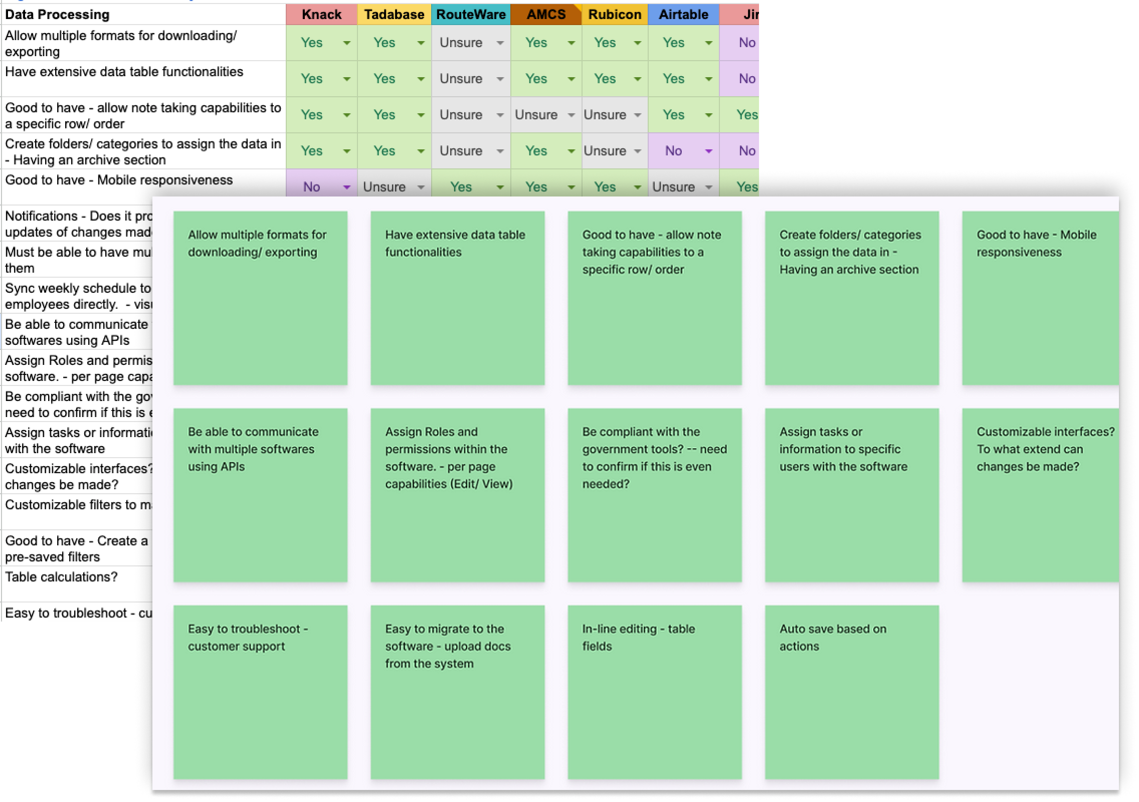
I delved deeper into solutions by conducting a feature analysis and competitive analysis. At this point, we were able to schedule a meeting with the DEP IT team for technical discussions, which allowed us to understand technical feasibility and considerations such as security compliance.
We were introduced to an existing case management system that was being used in other departments but not applied to the DEP processes. One of our biggest challenges was having to utilize a Scooby database with an API that wasn't able to directly update elements back to the 311 system. After discussion with the IT team, we presented 3 options to our client:
1. Integrating external softwares
2. Redesigning internal case management system
3. Leverage existing licenses for a temporary solution
We advocated for option #2, a complete redesign of the system with new features, flows, and UI to meet the needs of our end users while leveraging the existing tools.

How did I communicate the added value of this plan?
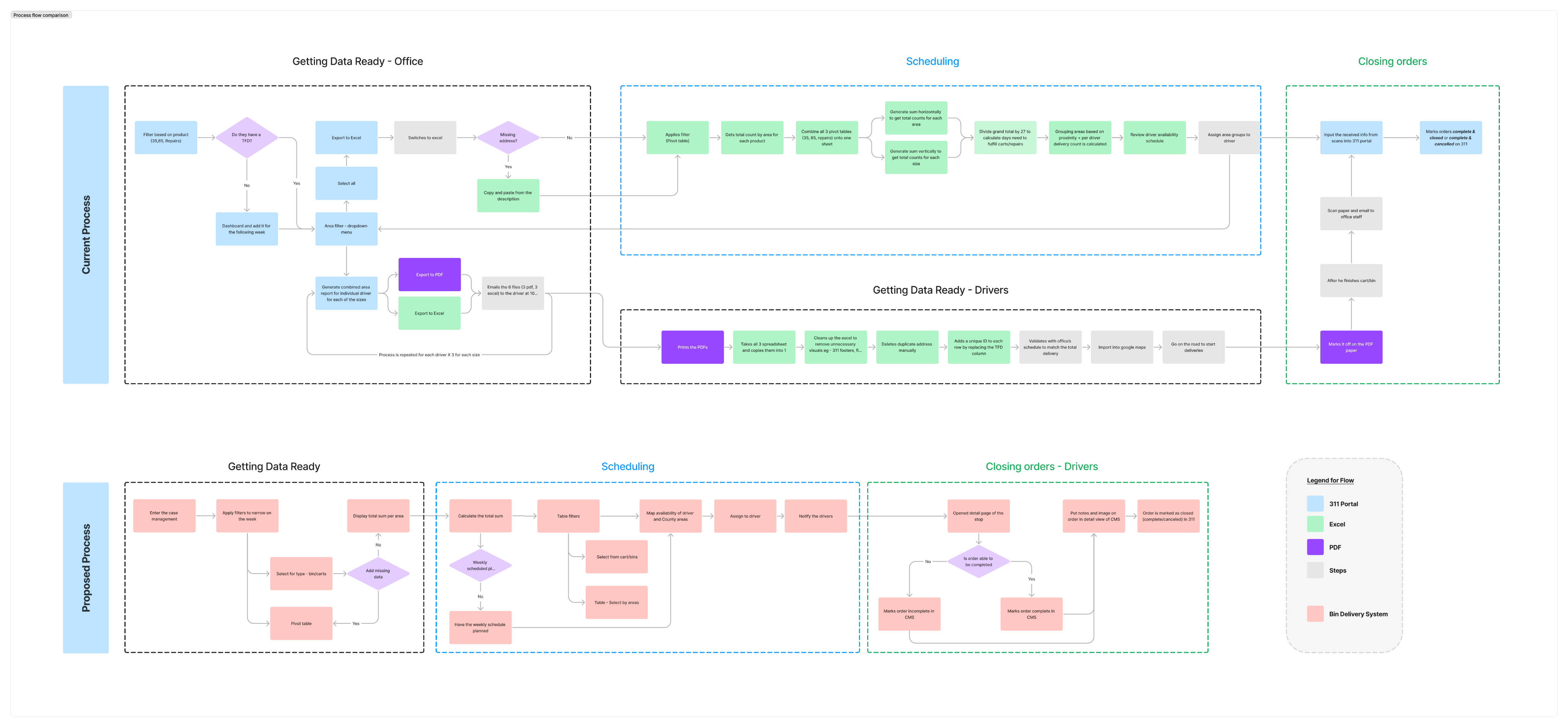
During this decision-making process, it was important to ensure that our client was aware of the tradeoffs, so I led a cost-benefit analysis and communicated the potential gains and risks during a briefing.
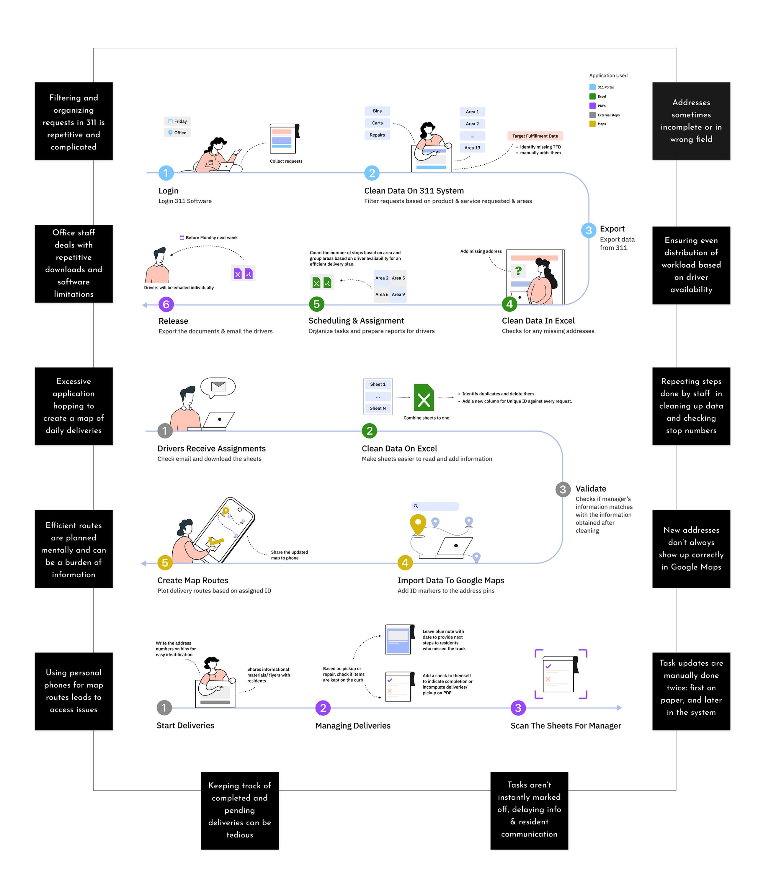
In order to illustrate how we would be able to reduce time and increase efficiency, we created an ideal flow that showed how our proposed solution workflow compared to the original workflow (above). This is a condensed view of the original workflow, but we anticipated reducing 60% of the steps from their existing flow to our ideal flow with the proposed solution.
Performance
- Utilize existing API to improve data cleaning process
- Simplify scheduling of drivers
- Create ability to track and close orders in the field
- Security compliance can be tackled more easily
- Reduce training time and maintenance costs with in-house solution
Tradeoffs
- Not able to incorporate automated route planning
- Tabling resident communication
- Potential technical limitations based on:
- Availability of IT staff to be approved for project work
- Feature development due to security constraints
- Compatibility with existing 311 system
Feasibility
- Implementation relies on DEP and 311 IT Teams
- Main cost is employee hours depending on workload for IT Teams
- Collaborate with IT Teams to develop bespoke solution with increased flexibility
- Our team can support design implementation through May and hand-off for further development after May

How did I build out this digital product?
Information Architecture
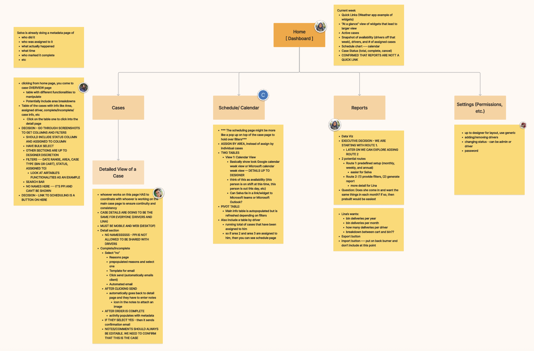
Based on all the information shown previously and our understanding of the existing bin delivery system, we created a visual representation of the application’s infrastructure, features, and hierarchy helped us identify specifics of the system prior to sketching.
We focused on:
- Differentiating features and tasks between the staff and drivers
- Establishing features that would add value and avoid redundancy
Sketching
We began by analyzing the information architecture from the previous sprint. This allowed us to gain a deeper understanding of the project requirements and identify any gaps in the existing design.
We focused on:
- Simple designs intensely focused on end goals
- Elements that would be intuitive and user-friendly for multiple stakeholders
- Scalability for future growth
Wireframing
After finalizing our initial sketches, we proceeded to create mid-fidelity prototypes in Figma that provided a more detailed representation of our design.
We focused on:
- Linking features based on task workflows
- Creating screens that transition smoothly between apps, devices, and software
- Ensuring key features in place prior to user tests
Technical Functionality
Once we had completed the initial screens for the system, we consulted with DEP's IT Developer to refine and develop a shared understanding of how the system would work.
We focused on:
- Iterating a responsive design for a tablet view used by drivers on the road
- Potentially integrating with ArcGIS for route mapping and during daily tasks
- Utilizing PowerBI to generate reports
How did I evaluate our designs?
As part of our design process, we wanted to ensure that our system was user-friendly and easy to use for the people who would be utilizing it every day. To achieve this, we conducted user testing with both drivers and office staff to gain a comprehensive understanding of their needs and requirements. We tested with two office managers and five drivers.
During the testing process, we developed task-based scenarios which were designed to reflect the real-world situations and workflows that users would encounter while using the system. This approach allowed us to evaluate the usability of our designs in a practical context, identifying areas where users encountered difficulties and where improvements could be made.
Flow 01.Office: Processing Data & Scheduling
Flow 02.Driver: Route Planning & Documentation
Research Insights: Office
We tested our prototype with 2 managers. They recognized its positive potential and offered numerous valuable insights:
“It is very helpful and you caught everything that I need to do, so that will make my life much easier, definitely.”
- Office Manager
Research Insights: Driver
We conducted users testing with 5 drivers who provided valuable feedback. Each driver tested on two flows: the desktop version which will be used when they start their day, and the tablet version which will be used when they're on the road. During the testing, drivers ran into scenarios where they described different needs for route planning and documentation.
“I look forward to trying this all out. I think it’s going to be really cool.”
- Driver 01
How did I turn user feedback into better designs?
Implementing Feedback
With the feedback received from the user testing, we worked on revising flows to best fit the needs described by the users. Our team had roughly 5 weeks left, so we moved quickly through the next stages to be able to test our high-fidelity screens.
At this point, the changes were focused on:
- Iterating flows to be smoother for tasks completion
- Integrating new features based on user feedback
Responsive Design System
We created a design system from scratch, with a design library and component library.
We focused on:
- Expanded on the DEP logo colors for a full design library
- Incorporated accessbility guidelines into our work
- Created a comprehensive component library for clear functionality in prototyping
High-Fidelity Prototype & User Testing
High-Fidelity Prototype & User Testing
We transitioned our screens to high-fidelity in preparation for our final set of user testing.
For this testing, we focused on:
- Finalizing visual elements and overall sability of the application
- Parsing out any changes related to edge cases
- Finishing any final changes prior to the handoff
Final Prototype: Office Manager Flow
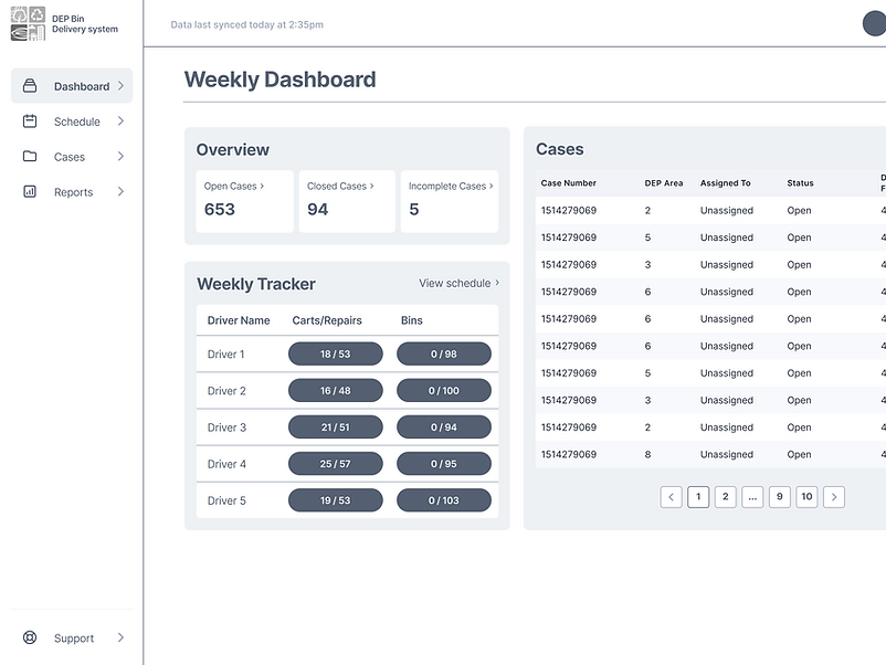
Fewer Applications
Our version of the system introduces new features throughout each step of the office manager's process which allows for less application jumping.
Real-Time Sync
The system syncs every 5 minutes, allowing the office manager to see almost real-time info about case status updates and documentation.
System Integration
The new system is integrated with the 311 system as much as possible, allowing the office staff & 311 call center reps to access all documentation easily.
Lower Mental Burden
The office manager can now schedule within the system with pre-filled data and adjustable fields, allowing for scheduling based on number of stops, available drivers, and distance between stops.
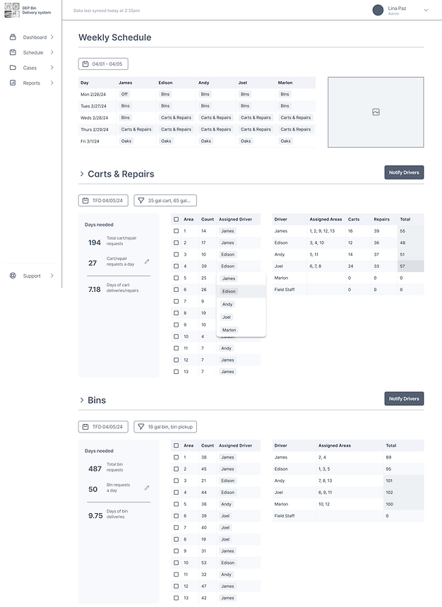
Final Prototype: Driver Flow 01.
Daily Morning Preparation on Desktop
Smoother Preparation
This flow assists drivers in preparing for their day ahead. They use this desktop version in the office, prior to getting on the road.
Loading the Trucks
We included info on the bins and carts needed for the whole week and for each route code, as this will help the drivers plan for their day appropriately.
Planning a Route
We advocated for integration with ArcGIS for optimized route planning, but until that is developed, we included key info on areas and route codes to assist in planning.
Adjusting the Filters
Based on driver feedback, we made sure that they could look at specific filters and make changes to their routes based on their best judgment.
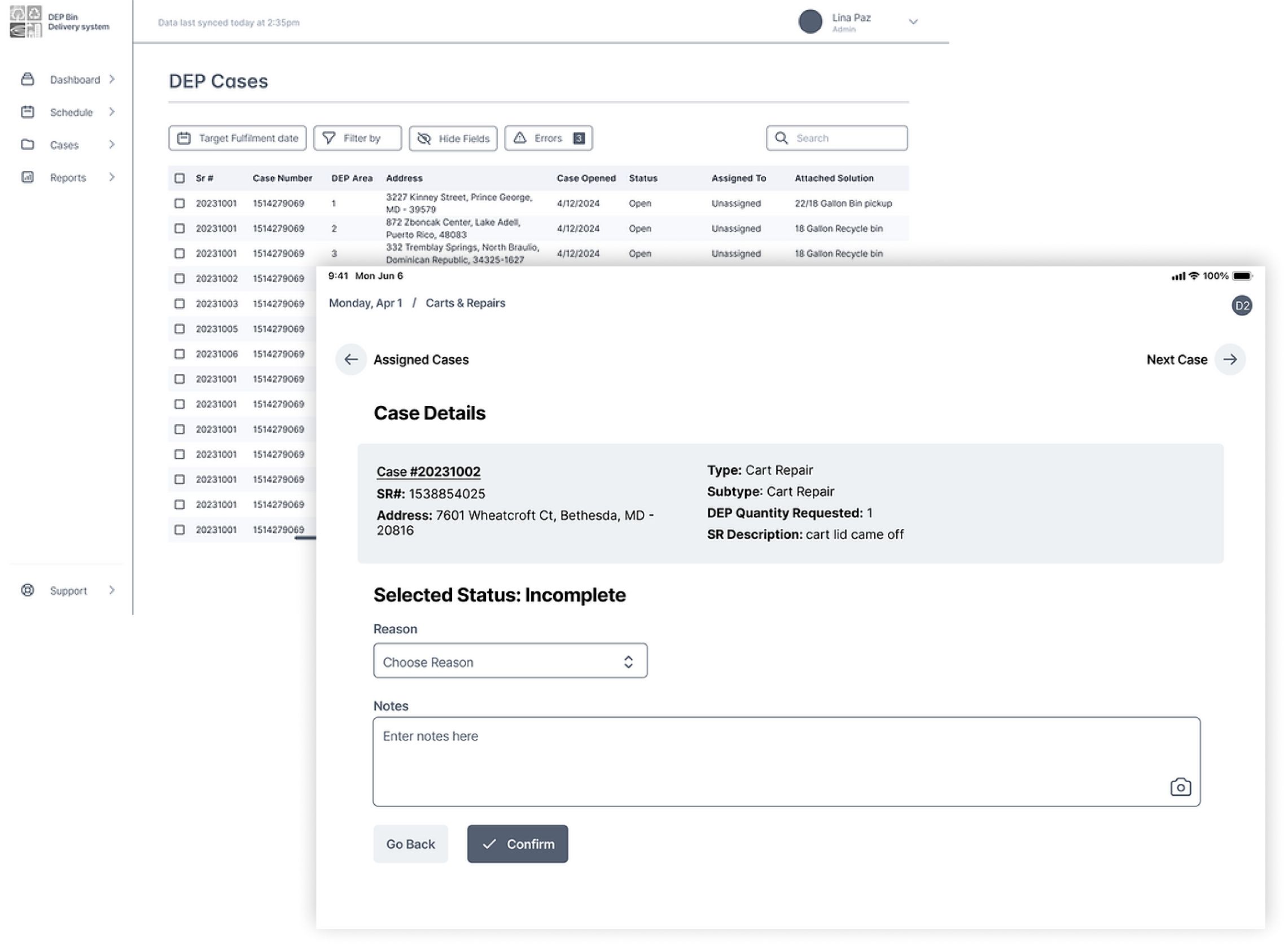
Final Prototype: Driver Flow 02.
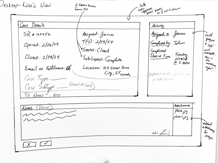
Fieldwork Documentation on Tablets
Driver Tablet Flow
This flow is built on a responsive design that allows the drivers to document their stops as they move along their route. This info feeds back to the office staff's view and provides almost real-time updates.
Reducing Info Delay
Residents will receive templated emails for confirmation of completed tasks. For tasks that were incomplete or marked for review, all the notes will be immediately available in the system, reducing any delay if the resident calls for info.
Easy Documentation
Drivers can now document tasks easily with specific categories: complete, incomplete, or needs review. We also included the ability to change a case's stats if something comes up, such as being able to finish a previously incomplete case.
2 Requests, 1 Address
We met the driver's specific user need of having two service requests (a pick-up and drop-off) under the same address. By utilizing drop downs with separate documentation, we paired the requests together while still allowing for different status changes.
How did I handoff the finished product?
Developer Documentation
We conducted users testing with 5 drivers who provided valuable feedback. Each driver tested on two flows: the desktop version which will be used when they start their day, and the tablet version which will be used when they're on the road. During the testing, drivers ran into scenarios where they described different needs for route planning and documentation.
Designing a CMS for Efficient Workflow
Product Design | Project Management | Design Systems | User Research
Using research and design to create a better CMS and efficient workflow for government employees.
Overview
In this project for the Montgomery County Department of Environmental Protection (DEP), my team and I were tasked with increasing efficiency in their internal processes and providing better communication with residents. Over nine months, we conducted research, designed a comprehensive data management system with responsive design elements, and conducted usability testing to result in a robust CMS and clean developer handoff.
Role
UX Designer & Researcher | Client Point-Of-Contact
Client
Department of Environmental Protection (DEP)
Montgomery County Government, Maryland
How can I meet our client’s needs?
Understanding the Client’s Workflow
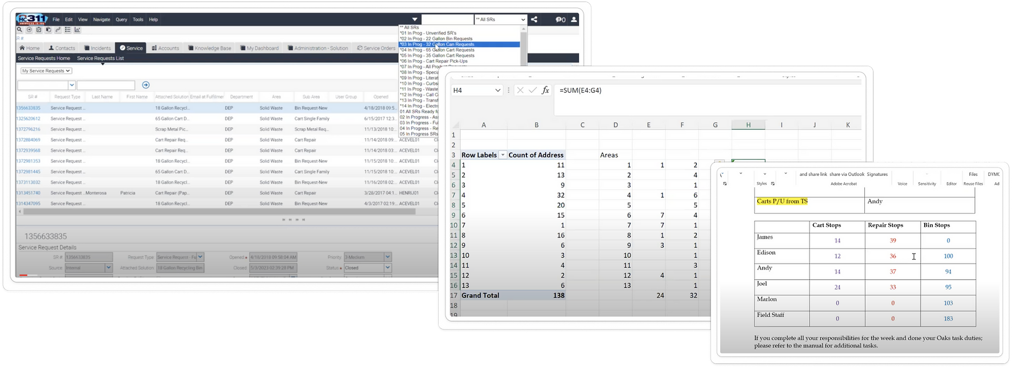
The Montgomery County, MD Department of Environmental Protection (DEP) is responsible for the management and distribution of recycling bins and carts. Their workflow was lengthy with areas of redundancy and long work-arounds, which led to longer time frames for scheduling drivers and delays in feeding data back into the legacy management system (311). This meant they used 4 softwares and repetitive calculations for manual scheduling, drivers had to do extra calculations and planning before each day's deliveries, and residents experienced 1-2 days' delayed communication about their deliveries.
Our Starting Point
Map and understand the current process and areas of friction
Identify and prioritize pain points in their current process for targeted improvements
Our Stakeholders
Residents
Office Staff
Driver Staff
311 Call Center Staff
Our Long-Term Goals
Reduce time-consuming inefficiencies in DEP’s internal processes
Provide better service and communication for residents
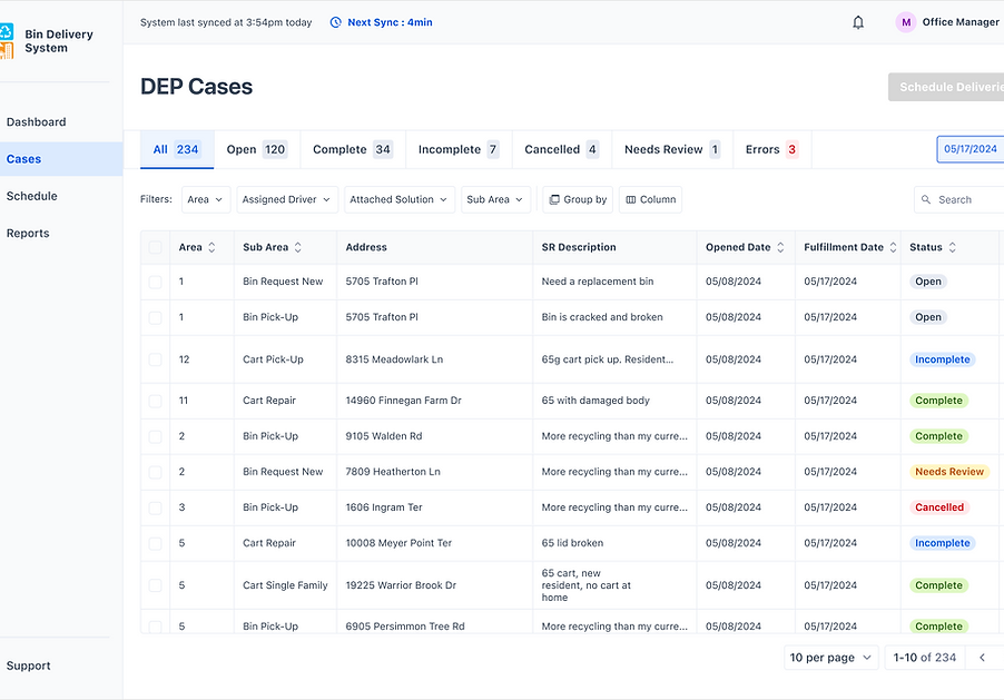
Our Solutions
Understanding the Client’s Workflow
Our team presented a delivery system that followed the process from cleaning data, scheduling drivers, loading trucks, communicating with residents, and closing requests.
Improved Integration Between Softwares
3 systems sync with each other & reduce external software usage (Google Maps, Excel, etc)
Reduction in Number of Steps Required
Roughly 40% decrease in steps from original workflow
Eliminating Process Overlap
Drivers not required to clean data further for route planning
Real-Time Data Updates
Drivers able to close and update requests while in the field
Improved Customer Communication
Residents are automatically notified when their request is completed
New Features Introduced
Introduced new features aimed at clearer communication, improved efficiency, and better usability
How did I turn ambiguity into a project direction?
I conducted interviews and observation with different end users to identify pain points.
Consolidating our research and analyzing it through affinity diagrams allowed us to pinpoint areas of friction and any workflow redundancies.
I found that the pain points of the office staff affected the pain points of the driver staff and vice versa.
With this in mind, it was imperative to consider how any potential solutions had a rippling effect across the entire workflow.
Prioritized Goals
Pushing for a prioritized list allowed me to plan for the most effective & viable solution, meaning it would increase efficiency and usability while remaining technically feasible and staying within our project deadline.
Goal #1
Streamline data processing & scheduling
Goal #2
Streamline route planning
Goal #3
Simplify tracking of completed and pending tasks
Goal #4
Reduce manual and repetitive work in task closure
Goal #5
Provide clear service time window
Goal #6
Provide insights for future integration with 311 system
How did I go from a goal to a potential solution?
I delved deeper into solutions by conducting a feature analysis and competitive analysis. At this point, we were able to schedule a meeting with the DEP IT team for technical discussions, which allowed us to understand technical feasibility and considerations such as security compliance.
We were introduced to an existing case management system that was being used in other departments but not applied to the DEP processes. One of our biggest challenges was having to utilize a Scooby database with an API that wasn't able to directly update elements back to the 311 system. After discussion with the IT team, we presented 3 options to our client:
1. Integrating external softwares
2. Redesigning internal case management system
3. Leverage existing licenses for a temporary solution
We advocated for option #2, a complete redesign of the system with new features, flows, and UI to meet the needs of our end users while leveraging the existing tools.

How did I communicate the added value of this plan?
During this decision-making process, it was important to ensure that our client was aware of the tradeoffs, so I led a cost-benefit analysis and communicated the potential gains and risks during a briefing.
In order to illustrate how we would be able to reduce time and increase efficiency, we created an ideal flow that showed how our proposed solution workflow compared to the original workflow (above). This is a condensed view of the original workflow, but we anticipated reducing 60% of the steps from their existing flow to our ideal flow with the proposed solution.
Performance
- Utilize existing API to improve data cleaning process
- Simplify scheduling of drivers
- Create ability to track and close orders in the field
- Security compliance can be tackled more easily
- Reduce training time and maintenance costs with in-house solution
Tradeoffs
- Not able to incorporate automated route planning
- Tabling resident communication
- Potential technical limitations based on:
- Availability of IT staff to be approved for project work
- Feature development due to security constraints
- Compatibility with existing 311 system
Feasibility
- Implementation relies on DEP and 311 IT Teams
- Main cost is employee hours depending on workload for IT Teams
- Collaborate with IT Teams to develop bespoke solution with increased flexibility
- Our team can support design implementation through May and hand-off for further development after May
How did I build out this digital product?
Sketching
We began by analyzing the information architecture from the previous sprint. This allowed us to gain a deeper understanding of the project requirements and identify any gaps in the existing design.
We focused on:
- Simple designs intensely focused on end goals
- Elements that would be intuitive and user-friendly for multiple stakeholders
- Scalability for future growth
Information Architecture
Based on all the information shown previously and our understanding of the existing bin delivery system, we created a visual representation of the application’s infrastructure, features, and hierarchy helped us identify specifics of the system prior to sketching.
We focused on:
- Differentiating features and tasks between the staff and drivers
- Establishing features that would add value and avoid redundancy
Wireframing
After finalizing our initial sketches, we proceeded to create mid-fidelity prototypes in Figma that provided a more detailed representation of our design.
We focused on:
- Linking features based on task workflows
- Creating screens that transition smoothly between apps, devices, and software
- Ensuring key features in place prior to user tests
Technical Functionality
Once we had completed the initial screens for the system, we consulted with DEP's IT Developer to refine and develop a shared understanding of how the system would work.
We focused on:
- Iterating a responsive design for a tablet view used by drivers on the road
- Potentially integrating with ArcGIS for route mapping and during daily tasks
- Utilizing PowerBI to generate reports
How did I evaluate our designs?
As part of our design process, we wanted to ensure that our system was user-friendly and easy to use for the people who would be utilizing it every day. To achieve this, we conducted user testing with both drivers and office staff to gain a comprehensive understanding of their needs and requirements. We tested with two office managers and five drivers.
During the testing process, we developed task-based scenarios which were designed to reflect the real-world situations and workflows that users would encounter while using the system. This approach allowed us to evaluate the usability of our designs in a practical context, identifying areas where users encountered difficulties and where improvements could be made.
Flow 01.Office: Processing Data & Scheduling
Flow 02.Driver: Route Planning & Documentation
Research Insights: Office
We tested our prototype with 2 managers. They recognized its positive potential and offered numerous valuable insights:
“It is very helpful and you caught everything that I need to do, so that will make my life much easier, definitely.”
- Office Manager
Research Insights: Driver
We conducted users testing with 5 drivers who provided valuable feedback. Each driver tested on two flows: the desktop version which will be used when they start their day, and the tablet version which will be used when they're on the road. During the testing, drivers ran into scenarios where they described different needs for route planning and documentation.
“I look forward to trying this all out. I think it’s going to be really cool.”
- Driver 01
How did I turn user feedback into better designs?
Responsive Design System
We created a design system from scratch, with a design library and component library.
We focused on:
- Expanded on the DEP logo colors for a full design library
- Incorporated accessbility guidelines into our work
- Created a comprehensive component library for clear functionality in prototyping
Implementing Feedback
With the feedback received from the user testing, we worked on revising flows to best fit the needs described by the users. Our team had roughly 5 weeks left, so we moved quickly through the next stages to be able to test our high-fidelity screens.
At this point, the changes were focused on:
- Iterating flows to be smoother for tasks completion
- Integrating new features based on user feedback
High-Fidelity Prototype & User Testing
High-Fidelity Prototype & User Testing
We transitioned our screens to high-fidelity in preparation for our final set of user testing.
For this testing, we focused on:
- Finalizing visual elements and overall sability of the application
- Parsing out any changes related to edge cases
- Finishing any final changes prior to the handoff
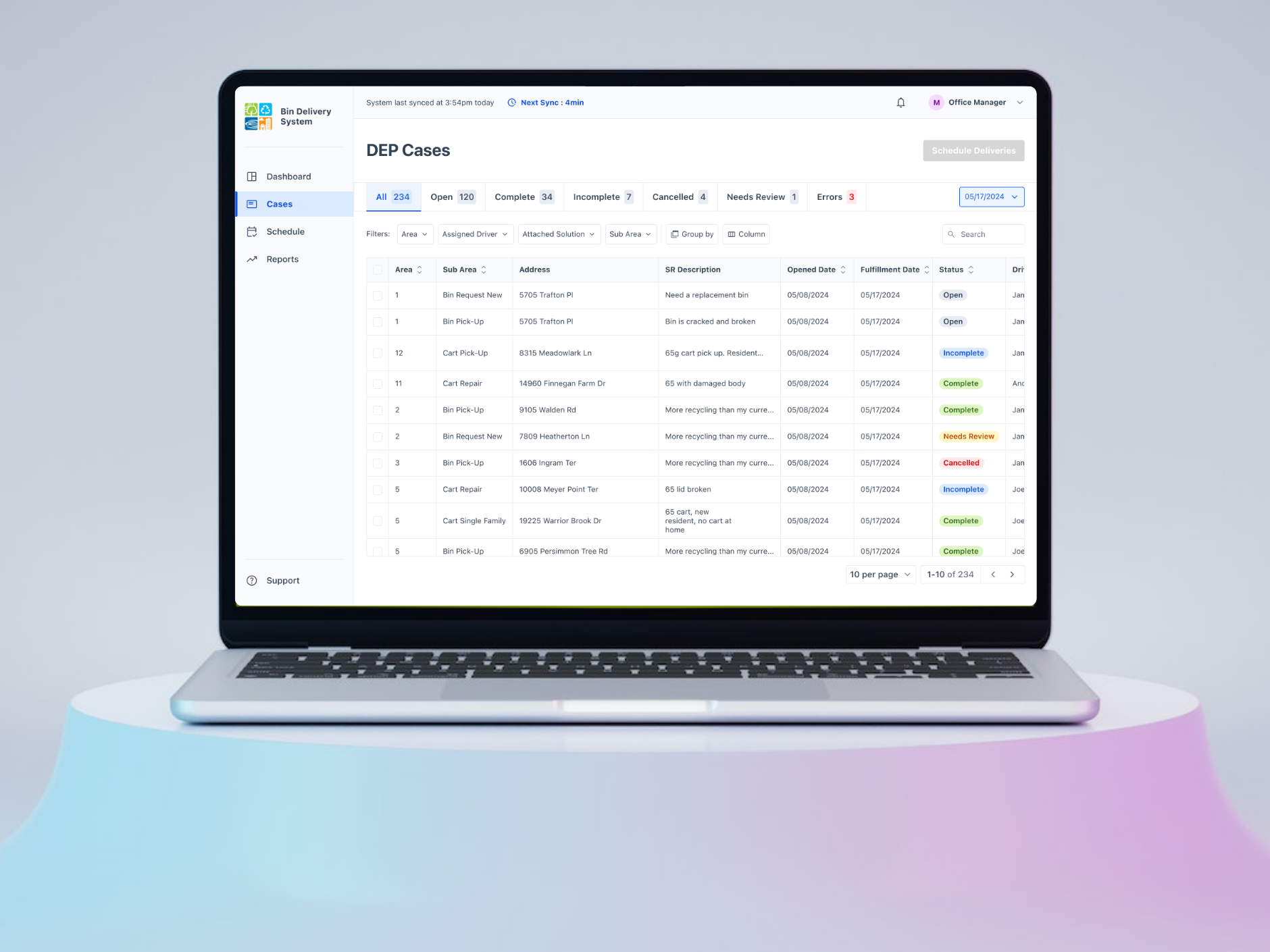
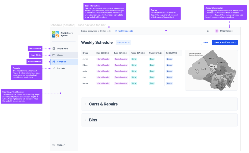
Final Prototype: Office Manager Flow
Fewer Applications
Our version of the system introduces new features throughout each step of the office manager's process which allows for less application jumping.
Real-Time Status Sync
The system syncs every 5 minutes, allowing the office manager to see almost real-time info about case status updates and documentation.
System Integration
The new system is integrated with the 311 system as much as possible, allowing the office staff & 311 call center reps to access all documentation easily.
Lower Mental Burden
The office manager can now schedule within the system with pre-filled data and adjustable fields, allowing for scheduling based on number of stops, available drivers, and distance between stops.
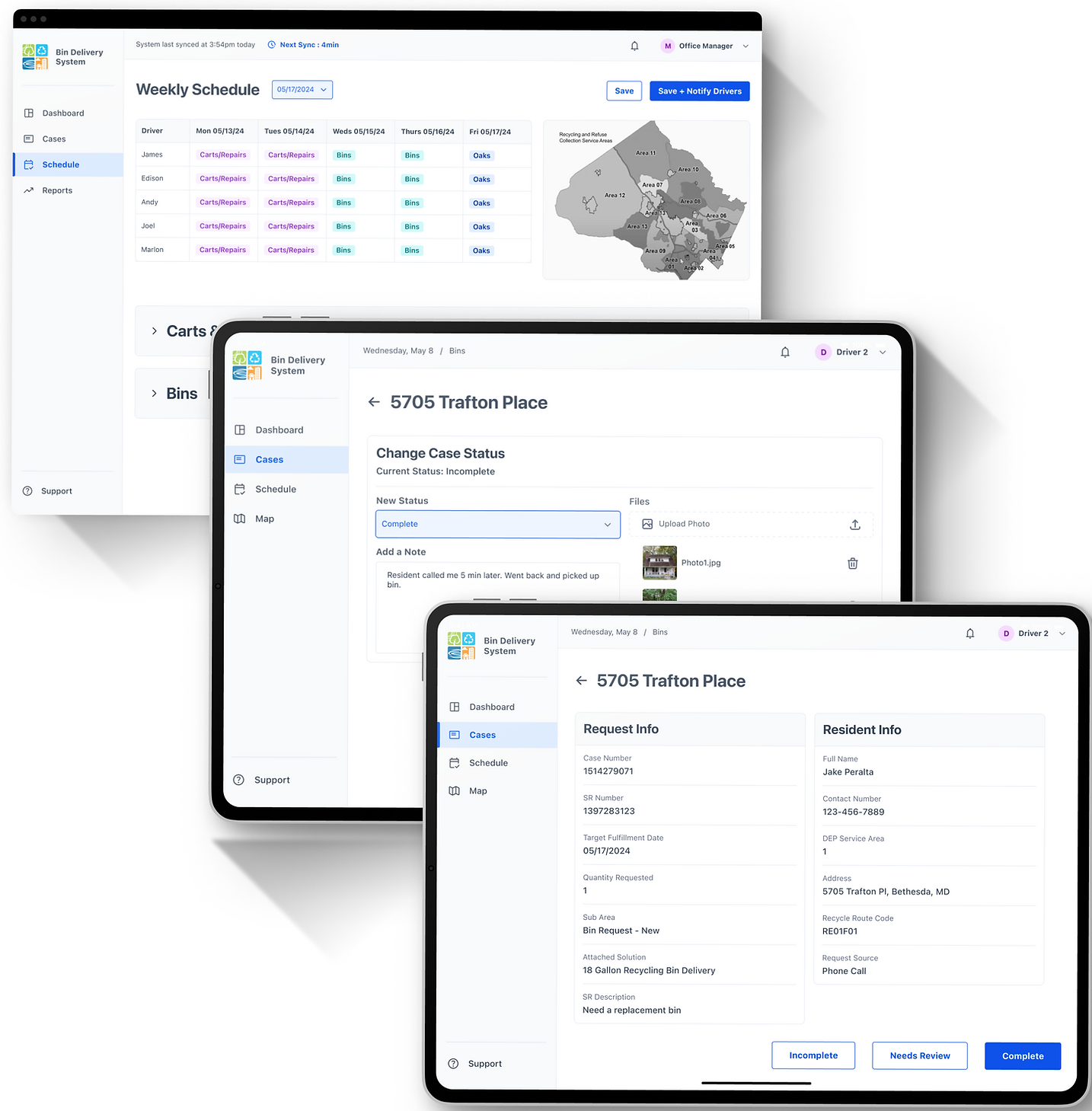
Final Prototype: Driver Flow 01.
Daily Morning Preparation on Desktop
Smoother Preparation
This flow assists drivers in preparing for their day ahead. They use this desktop version in the office, prior to getting on the road.
Loading the Trucks
We included info on the bins and carts needed for the whole week and for each route code, as this will help the drivers plan for their day appropriately.
Planning the Routes
We advocated for integration with ArcGIS for optimized route planning, but until that is developed, we included key info on areas and route codes to assist in planning.
Adjusting the Filters
Based on driver feedback, we made sure that they could look at specific filters and make changes to their routes based on their best judgment.
Final Prototype: Driver Flow 02.
Fieldwork Documentation on Tablets
Field Work Tablet Flow
This flow is built on a responsive design that allows the drivers to document their stops as they move along their route. This info feeds back to the office staff's view and provides almost real-time updates.
Reducing Info Delay
Residents will receive templated emails for confirmation of completed tasks. For tasks that were incomplete or marked for review, all the notes will be immediately available in the system, reducing any delay if the resident calls for info.
Planning the Routes
Drivers can now document tasks easily with specific categories: complete, incomplete, or needs review. We also included the ability to change a case's stats if something comes up, such as being able to finish a previously incomplete case.
2 Requests, 1 Address
We met the driver's specific user need of having two service requests (a pick-up and drop-off) under the same address. By utilizing drop downs with separate documentation, we paired the requests together while still allowing for different status changes.
How did I handoff the finished product?
Developer Documentation
We conducted users testing with 5 drivers who provided valuable feedback. Each driver tested on two flows: the desktop version which will be used when they start their day, and the tablet version which will be used when they're on the road. During the testing, drivers ran into scenarios where they described different needs for route planning and documentation.
Designing a CMS for Efficient Workflow
Product Design | Project Management | Design Systems | User Research
Using research and design to create a better CMS and efficient workflow for government employees.
Overview
In this project for the Montgomery County Department of Environmental Protection (DEP), my team and I were tasked with increasing efficiency in their internal processes and providing better communication with residents. Over nine months, we conducted research, designed a comprehensive data management system with responsive design elements, and conducted usability testing to result in a robust CMS and clean developer handoff.
Role
UX Designer & Researcher | Client Point-Of-Contact
Client
Department of Environmental Protection (DEP)
Montgomery County Government, Maryland
How can I meet our client’s needs?
Understanding the Client’s Workflow
The Montgomery County, MD Department of Environmental Protection (DEP) is responsible for the management and distribution of recycling bins and carts. Their workflow was lengthy with areas of redundancy and long work-arounds, which led to longer time frames for scheduling drivers and delays in feeding data back into the legacy management system (311). This meant they used 4 softwares and repetitive calculations for manual scheduling, drivers had to do extra calculations and planning before each day's deliveries, and residents experienced 1-2 days' delayed communication about their deliveries.
Our Starting Point
Map and understand the current process and areas of friction
Identify and prioritize pain points in their current process for targeted improvements
Our Stakeholders
Residents
Office Staff
Driver Staff
311 Call Center Staff
Our Long-Term Goals
Reduce time-consuming inefficiencies in DEP’s internal processes
Provide better service and communication for residents
Our Solutions
Understanding the Client’s Workflow
Our team presented a delivery system that followed the process from cleaning data, scheduling drivers, loading trucks, communicating with residents, and closing requests.
Improved Integration Between Softwares
3 systems sync with each other & reduce external software usage (Google Maps, Excel, etc)
Reduction in Number of Steps Required
Roughly 40% decrease in steps from original workflow
Eliminating Process Overlap
Drivers not required to clean data further for route planning
Real-Time Data Updates
Drivers able to close and update requests while in the field
Improved Customer Communication
Residents are automatically notified when their request is completed
New Features Introduced
Introduced new features aimed at clearer communication, improved efficiency, and better usability
How did I turn ambiguity into a project direction?
I conducted interviews and observation with different end users to identify pain points.
Consolidating our research and analyzing it through affinity diagrams allowed us to pinpoint areas of friction and any workflow redundancies.
I found that the pain points of the office staff affected the pain points of the driver staff and vice versa.
With this in mind, it was imperative to consider how any potential solutions had a rippling effect across the entire workflow.
Prioritized Goals
Pushing for a prioritized list allowed me to plan for the most effective & viable solution, meaning it would increase efficiency and usability while remaining technically feasible and staying within our project deadline.
Goal #1
Streamline data processing & scheduling
Goal #2
Streamline route planning
Goal #3
Simplify tracking of completed and pending tasks
Goal #4
Reduce manual and repetitive work in task closure
Goal #5
Provide clear service time window
Goal #6
Provide insights for future integration with 311 system
How did I go from a goal to a potential solution?
I delved deeper into solutions by conducting a feature analysis and competitive analysis. At this point, we were able to schedule a meeting with the DEP IT team for technical discussions, which allowed us to understand technical feasibility and considerations such as security compliance.
We were introduced to an existing case management system that was being used in other departments but not applied to the DEP processes. One of our biggest challenges was having to utilize a Scooby database with an API that wasn't able to directly update elements back to the 311 system. After discussion with the IT team, we presented 3 options to our client:
1. Integrating external softwares
2. Redesigning internal case management system
3. Leverage existing licenses for a temporary solution
We advocated for option #2, a complete redesign of the system with new features, flows, and UI to meet the needs of our end users while leveraging the existing tools.

How did I communicate the added value of this plan?
During this decision-making process, it was important to ensure that our client was aware of the tradeoffs, so I led a cost-benefit analysis and communicated the potential gains and risks during a briefing.
In order to illustrate how we would be able to reduce time and increase efficiency, we created an ideal flow that showed how our proposed solution workflow compared to the original workflow (above). This is a condensed view of the original workflow, but we anticipated reducing 60% of the steps from their existing flow to our ideal flow with the proposed solution.
Performance
- Utilize existing API to improve data cleaning process
- Simplify scheduling of drivers
- Create ability to track and close orders in the field
- Security compliance can be tackled more easily
- Reduce training time and maintenance costs with in-house solution
Tradeoffs
- Not able to incorporate automated route planning
- Tabling resident communication
- Potential technical limitations based on:
- Availability of IT staff to be approved for project work
- Feature development due to security constraints
- Compatibility with existing 311 system
Feasibility
- Implementation relies on DEP and 311 IT Teams
- Main cost is employee hours depending on workload for IT Teams
- Collaborate with IT Teams to develop bespoke solution with increased flexibility
- Our team can support design implementation through May and hand-off for further development after May
How did I build out this digital product?
Information Architecture
Based on all the information shown previously and our understanding of the existing bin delivery system, we created a visual representation of the application’s infrastructure, features, and hierarchy helped us identify specifics of the system prior to sketching.
We focused on:
- Differentiating features and tasks between the staff and drivers
- Establishing features that would add value and avoid redundancy
Sketching
We began by analyzing the information architecture from the previous sprint. This allowed us to gain a deeper understanding of the project requirements and identify any gaps in the existing design.
We focused on:
- Simple designs intensely focused on end goals
- Elements that would be intuitive and user-friendly for multiple stakeholders
- Scalability for future growth
Wireframing
After finalizing our initial sketches, we proceeded to create mid-fidelity prototypes in Figma that provided a more detailed representation of our design.
We focused on:
- Linking features based on task workflows
- Creating screens that transition smoothly between apps, devices, and software
- Ensuring key features in place prior to user tests
Technical Functionality
Once we had completed the initial screens for the system, we consulted with DEP's IT Developer to refine and develop a shared understanding of how the system would work.
We focused on:
- Iterating a responsive design for a tablet view used by drivers on the road
- Potentially integrating with ArcGIS for route mapping and during daily tasks
- Utilizing PowerBI to generate reports
How did I evaluate our designs?
As part of our design process, we wanted to ensure that our system was user-friendly and easy to use for the people who would be utilizing it every day. To achieve this, we conducted user testing with both drivers and office staff to gain a comprehensive understanding of their needs and requirements. We tested with two office managers and five drivers.
During the testing process, we developed task-based scenarios which were designed to reflect the real-world situations and workflows that users would encounter while using the system. This approach allowed us to evaluate the usability of our designs in a practical context, identifying areas where users encountered difficulties and where improvements could be made.
Flow 01.Office: Processing Data & Scheduling
Flow 02.Driver: Route Planning & Documentation
Research Insights: Office
We tested our prototype with 2 managers. They recognized its positive potential and offered numerous valuable insights:
“It is very helpful and you caught everything that I need to do, so that will make my life much easier, definitely.”
- Office Manager
Research Insights: Driver
We conducted users testing with 5 drivers who provided valuable feedback.
Each driver tested on two flows: the desktop version which will be used when they start their day, and the tablet version which will be used when they're on the road.
During the testing, drivers ran into scenarios where they described different needs for route planning and documentation.
“I look forward to trying this all out. I think it’s going to be really cool.”
- Driver 01
How did I turn user feedback into better designs?
Implementing Feedback
With the feedback received from the user testing, we worked on revising flows to best fit the needs described by the users. Our team had roughly 5 weeks left, so we moved quickly through the next stages to be able to test our high-fidelity screens.
At this point, the changes were focused on:
- Iterating flows to be smoother for tasks completion
- Integrating new features based on user feedback
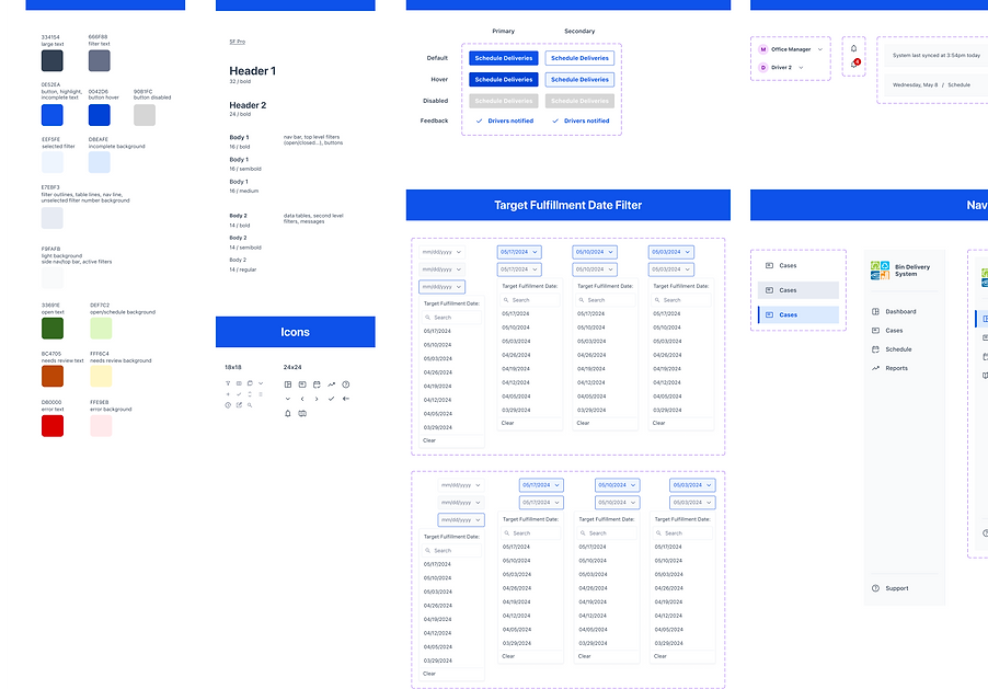
Responsive Design System
We created a design system from scratch, with a design library and component library.
We focused on:
- Expanded on the DEP logo colors for a full design library
- Incorporated accessbility guidelines into our work
- Created a comprehensive component library for clear functionality in prototyping
High-Fidelity Prototype & User Testing
We transitioned our screens to high-fidelity in preparation for our final set of user testing.
For this testing, we focused on:
- Finalizing visual elements and overall usability of the application
- Parsing out any changes related to edge cases
- Finishing any final changes prior to the handoff
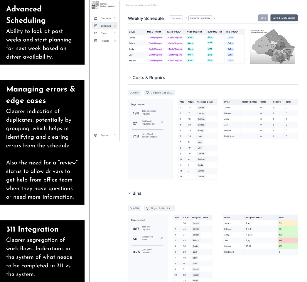
Final Prototype: Office Manager Flow
Fewer Applications
Our version of the system introduces new features throughout each step of the office manager's process which allows for less application jumping.
Real-Time Sync
The system syncs every 5 minutes, allowing the office manager to see almost real-time info about case status updates and documentation.
System Integration
The new system is integrated with the 311 system as much as possible, allowing the office staff & 311 call center reps to access all documentation easily.
Lower Mental Burden
The office manager can now schedule within the system with pre-filled data and adjustable fields, allowing for scheduling based on number of stops, available drivers, and distance between stops.
Final Prototype: Driver Flow 01.
Daily Morning Preparation on Desktop
Smoother Preparation
This flow assists drivers in preparing for their day ahead. They use this desktop version in the office, prior to getting on the road.
Loading the Trucks
We included info on the bins and carts needed for the whole week and for each route code, as this will help the drivers plan for their day appropriately.
Planning a Route
We advocated for integration with ArcGIS for optimized route planning, but until that is developed, we included key info on areas and route codes to assist in planning.
Adjusting the Filters
Based on driver feedback, we made sure that they could look at specific filters and make changes to their routes based on their best judgment.
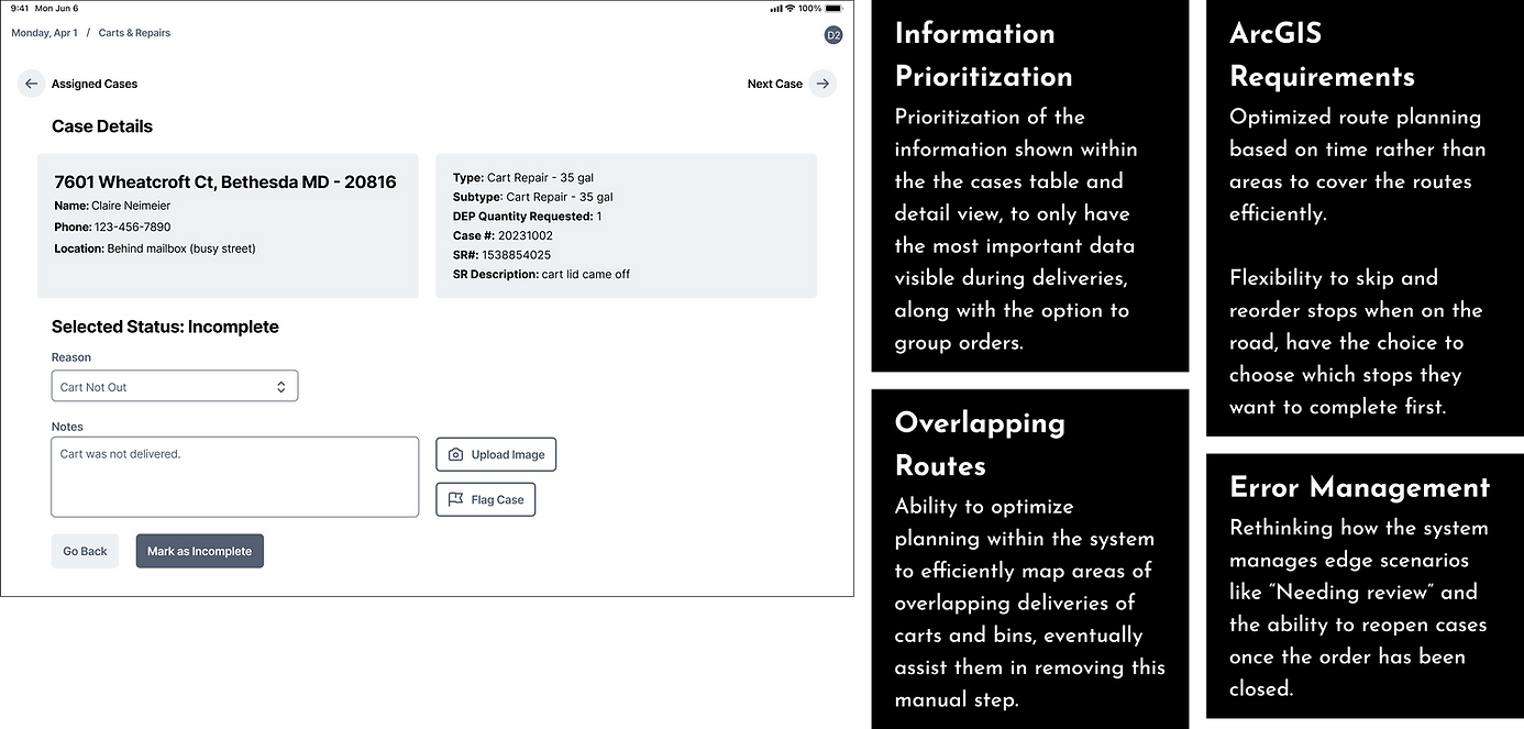
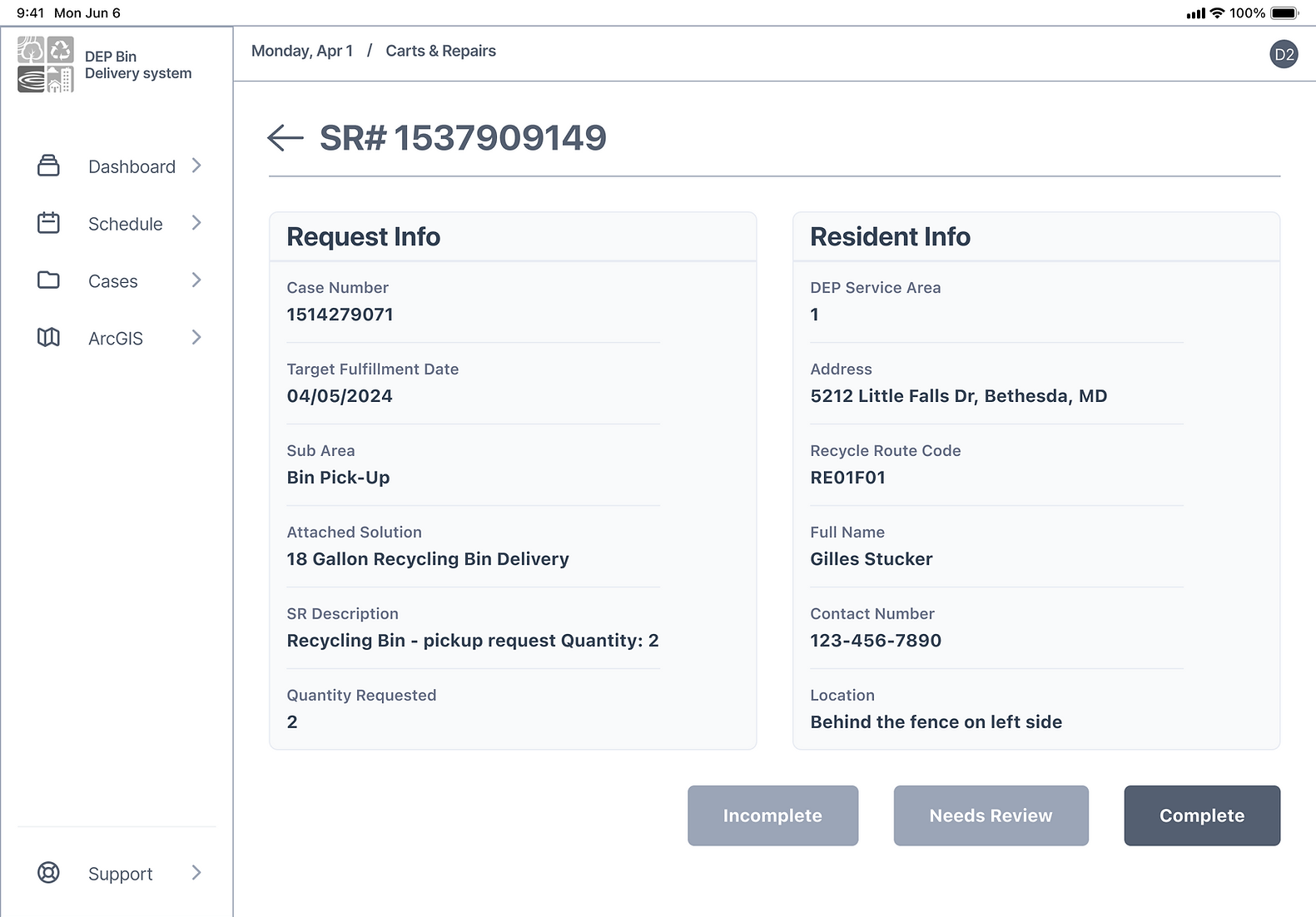
Final Prototype: Driver Flow 02.
Fieldwork Documentation on Tablets
Driver Tablet Flow
This flow is built on a responsive design that allows the drivers to document their stops as they move along their route. This info feeds back to the office staff's view and provides almost real-time updates.
Reducing Info Delay
Residents will receive templated emails for confirmation of completed tasks. For tasks that were incomplete or marked for review, all the notes will be immediately available in the system, reducing any delay if the resident calls for info.
Easy Documentation
Drivers can now document tasks easily with specific categories: complete, incomplete, or needs review. We also included the ability to change a case's stats if something comes up, such as being able to finish a previously incomplete case.
2 Requests, 1 Address
We met the driver's specific user need of having two service requests (a pick-up and drop-off) under the same address. By utilizing drop downs with separate documentation, we paired the requests together while still allowing for different status changes.
How did I handoff the finished product?
Developer Documentation
With this handoff, we provided info about using the new system, particularly how it works with the existing 311 system and any limitations. We ensured that the DEP IT team would be able to work off our prototype and documentation to implement this successfully.
To ensure successful implementation and usage, we developed several essential documents for the team in addition to the Developer Documentation, including a Business & Technical Case and Training Documentation.