
Reimagining a More Accessible Google Maps
UX Research | UX Design | Product Design | AI-Assisted Workflow
An app designed from the first idea to final prototype, focused on increasing adoption and adherence for older adult users.
Overview
In this course project, my goal was to create expanded accessibility features for mobile use of Google Maps focused especially on: cognitive impairments, anxiety related mental illnesses, and physical impairments.
My team wanted to support reliable and user friendly transit guidance for our users by creating a simplified assistive mode within Google Maps, which addresses the transit needs for different disability groups and creates a less stressful experience.
This project features AI-assisted workflow and showcases how AI can be used to supplement traditional user research such as interviews for a more rapid product iteration.
Role
UX Designer & Researcher | Team of 3
Project
Course Project during Master’s of Human-Computer Interaction

“I wish there was a button on the app that would just say ‘for retirees and for non-retirees.’ You click on that button and it would be kinder. It doesn’t assume.
There’s a world of difference between a 20 yr old and 70 yr old in terms of how fast they go through the app. I wish there was a button that said, please be patient, student driver.”
-- Excerpt from Interview with User 1
How did I establish a clear direction?
Due to a short timeline, my team followed the Google Sprint format and AI-assisted workflows. Based on this format, we started with understanding our users with key questions, personas, and research.
1. Can we provide accurate, real-time information?
2. Can we create reliable & easy to use features for transit users
3. Can we make users feel comfortable and confident in their solo travel?

How did I understand our users?
Defining Parameters
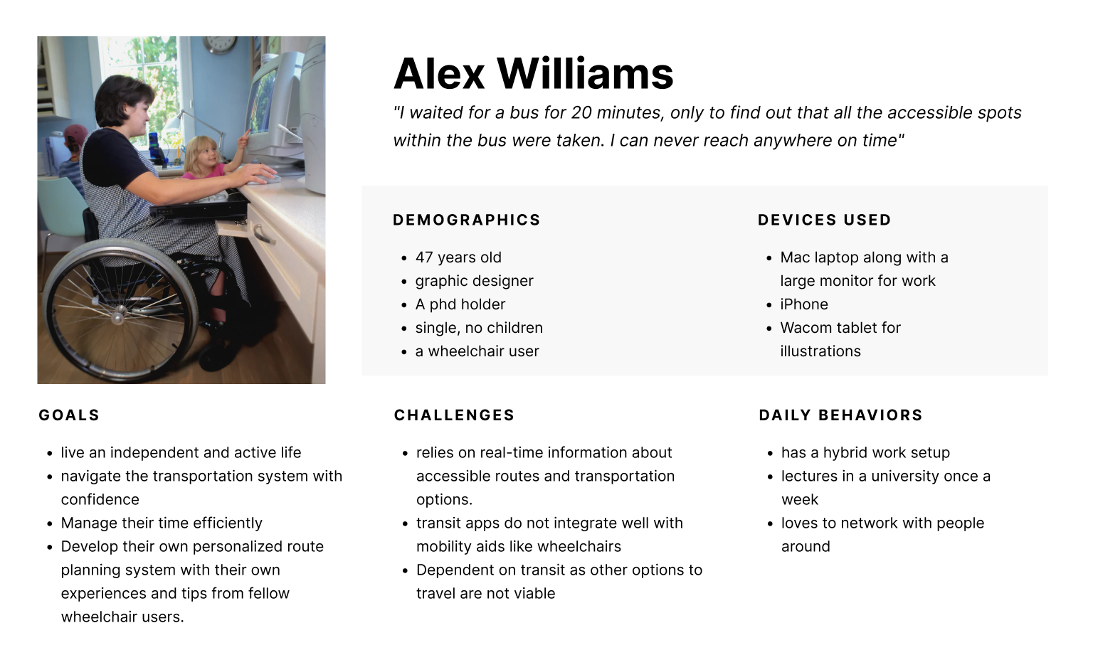
Our targeted users are people with motor impairments (permanent, temporary, and situational), people with cognitive impairments (such as Autism Spectrum Disorder and Down’s Syndrome), and people with mental health challenges (specifically anxiety-related mental illnesses). We narrowed this group down to a more manageable audience with the following parameters:
- Adults (16-70 years)
- Able to go on public transportation independently
- Able to follow a routine and navigate mostly on their own
- Able to communicate their needs either verbally or through assistive technology
- Fairly active with existing jobs, hobbies, or social groups
First Round: AI-Generated Personas
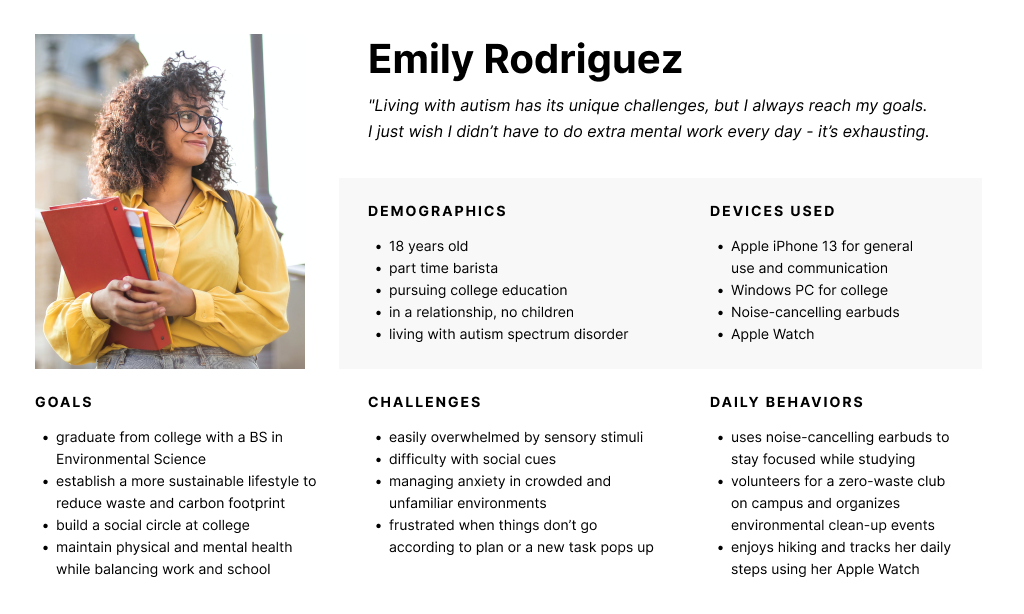
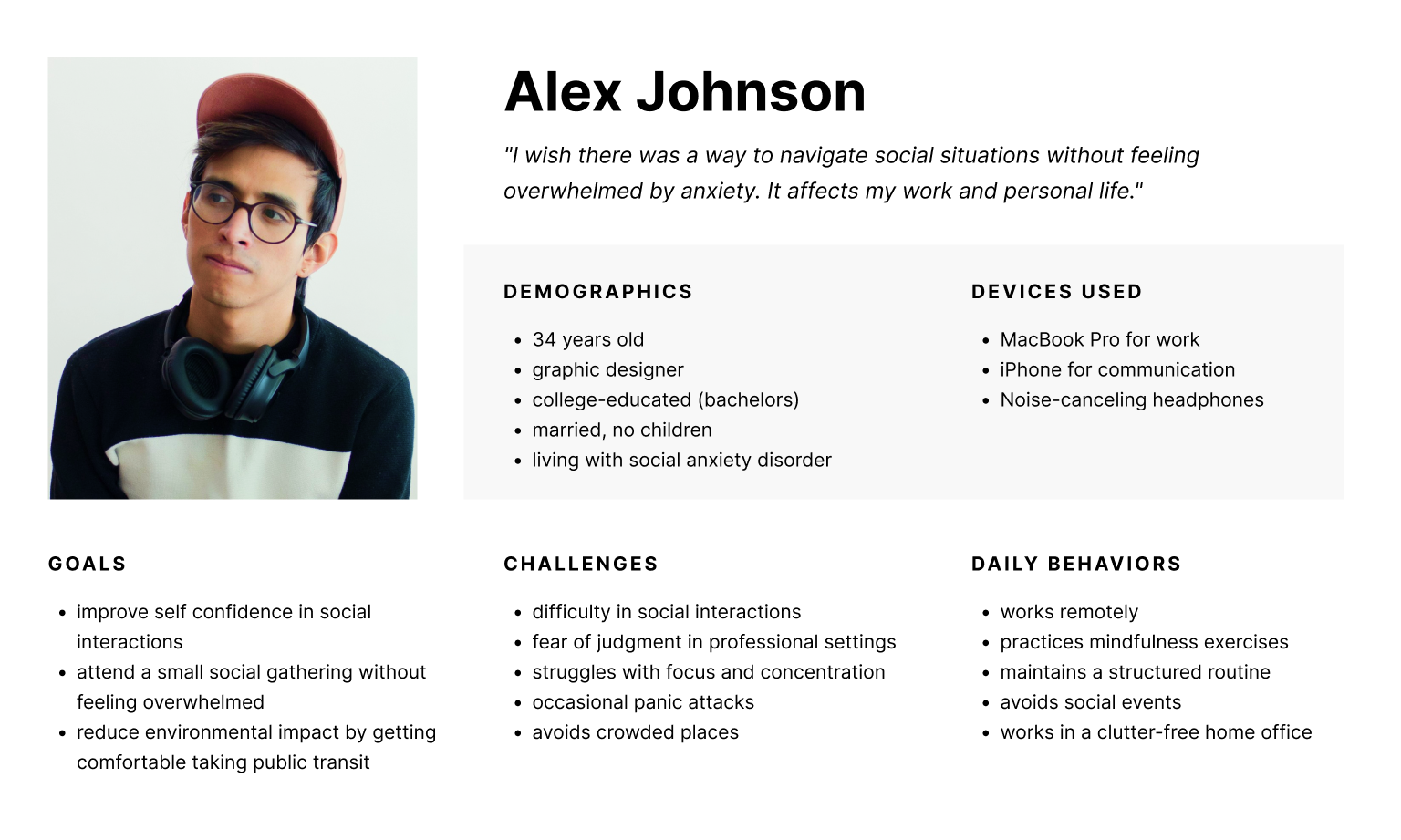
We asked ChatGPT to generate several user personas based on our target audience segments, specifically asking for a diverse range of demographics, behaviors, goals, etc.We then used those results as the basis for our final personas, modifying and adding elements to better illustrate the impacts of the challenges faced by our target users.
How did I process qualitative data into insights?
Second Round: Remote User Interviews
Due to lack of resources and time, our team pivoted and took a convenience sample for our interviews that included people adjacent to users with disabilities rather than the users with disabilities themselves.
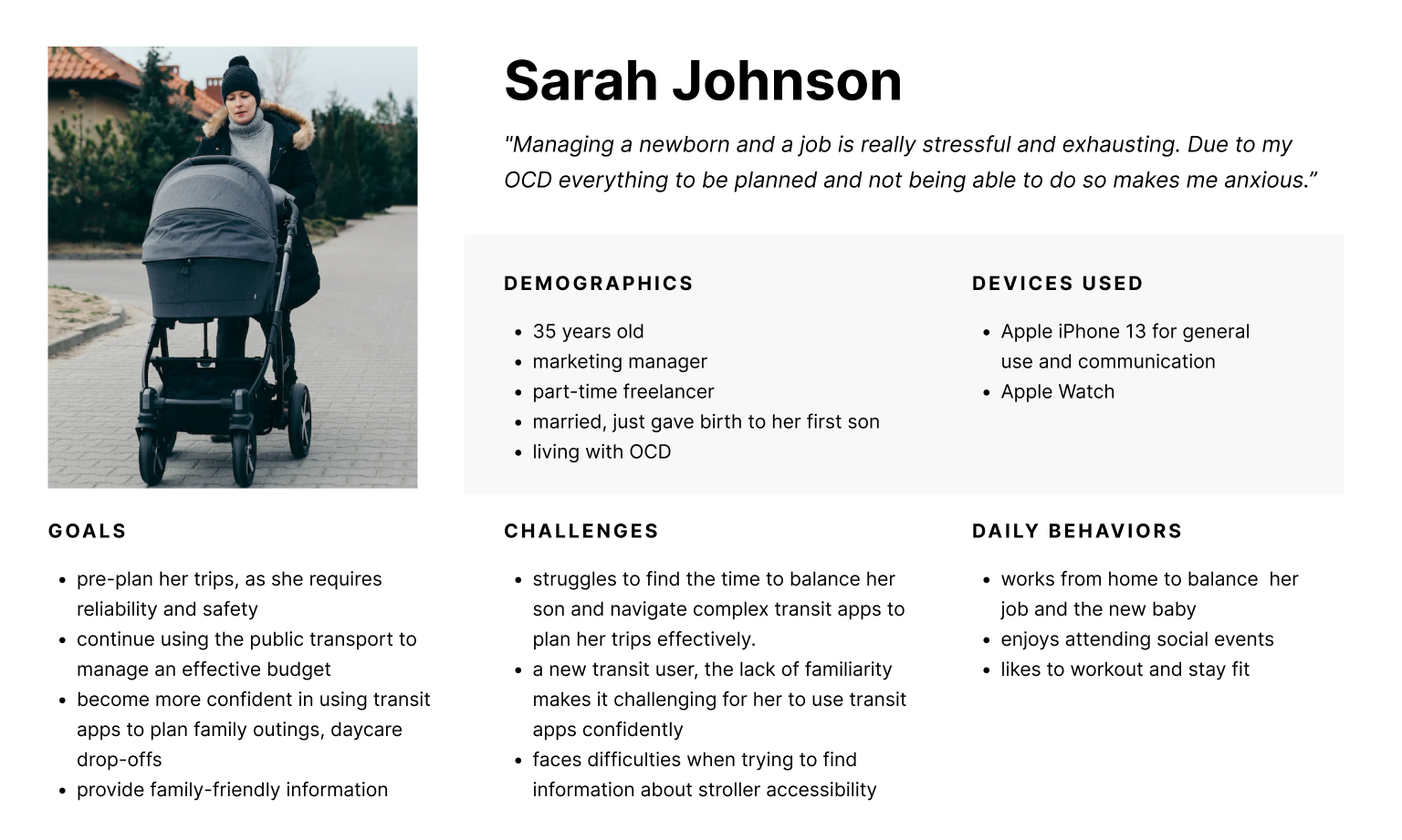
Our final group of participants included a mother with anxiety traveling with young kids, a retiree with short-term memory loss, as well people adjacent to users with disabilities: a special needs school aide and a mother of a son with severe autism. We conducted remote interviews to explore what their experience and sentiments were surrounding public transportation. By keeping the questions open-ended and intentionally avoiding any bias, we were able to gather new insights.
”A lot of time we underestimate [autistic adult children], we use our standards to test them. Reading and comprehension is hard, but he leverages other skills.”
-- User 2
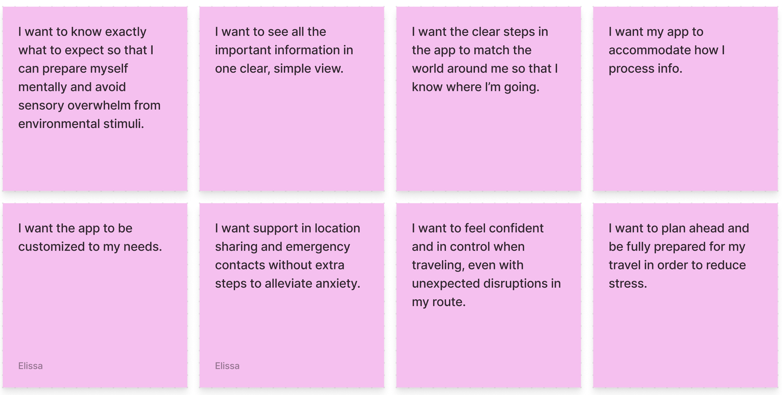
“ If it’s simple directions I feel like it’ll be okay. When I pull it up and it’s a lot of directions I start [mimics heavy breathing]. That gives me stress when it doesn’t tell you the next step fast enough.
-- User 3
“I know I should go to Google maps, but there’s something... My eyes or the layout... I don’t know why I don’t like it. Directions on left and map on right. The more preview the better for me.”
-- User 3
Pinpointing Pain Points
From our user interviews, we found that pain points can be categorized into three stages:
- Planning the route beforehand
- Matching the physical world to digital instructions
- Adapting to unexpected obstacles.
How did I translate pain points into design iterations?
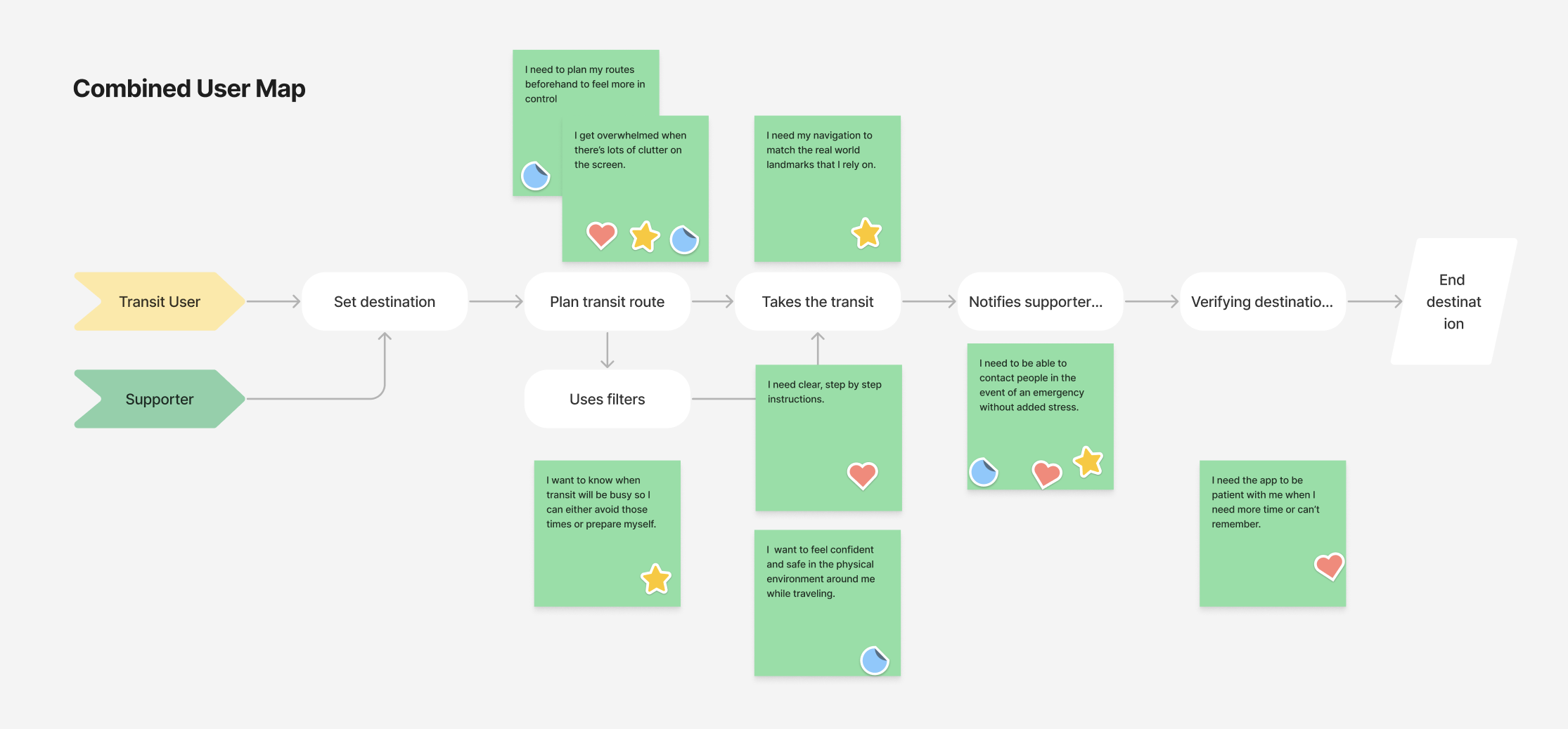
User Map
We created individual user maps for three specific personas and then distilled those down into one simplified, combined user map which lays out the process of navigating public transit. We mapped specific insights from our affinity diagram onto the flow to help us identify key aspects to focus on in the ideation phase.
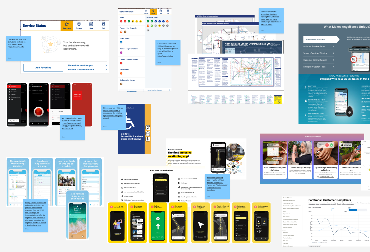
Lightning Demos
For rapid feature identification, our team conducted lightning demos from comparable apps to evaluate which features might be worth implementing or exploring further. This led us into the mindset for sketching.
Sketching
Our team used Crazy 8’s to start our sketches, and landed on some key features including:
- Visuals of accessibility features such as highlighted areas on a train car indicating open accessible seating
- Increased preview of upcoming steps while staying collapsed
- Indicators for busyness, sound levels, and other sensory stimuli
- Saved routes (not just bookmarked destinations)
- Preset emergency contacts for both support and/or crisis
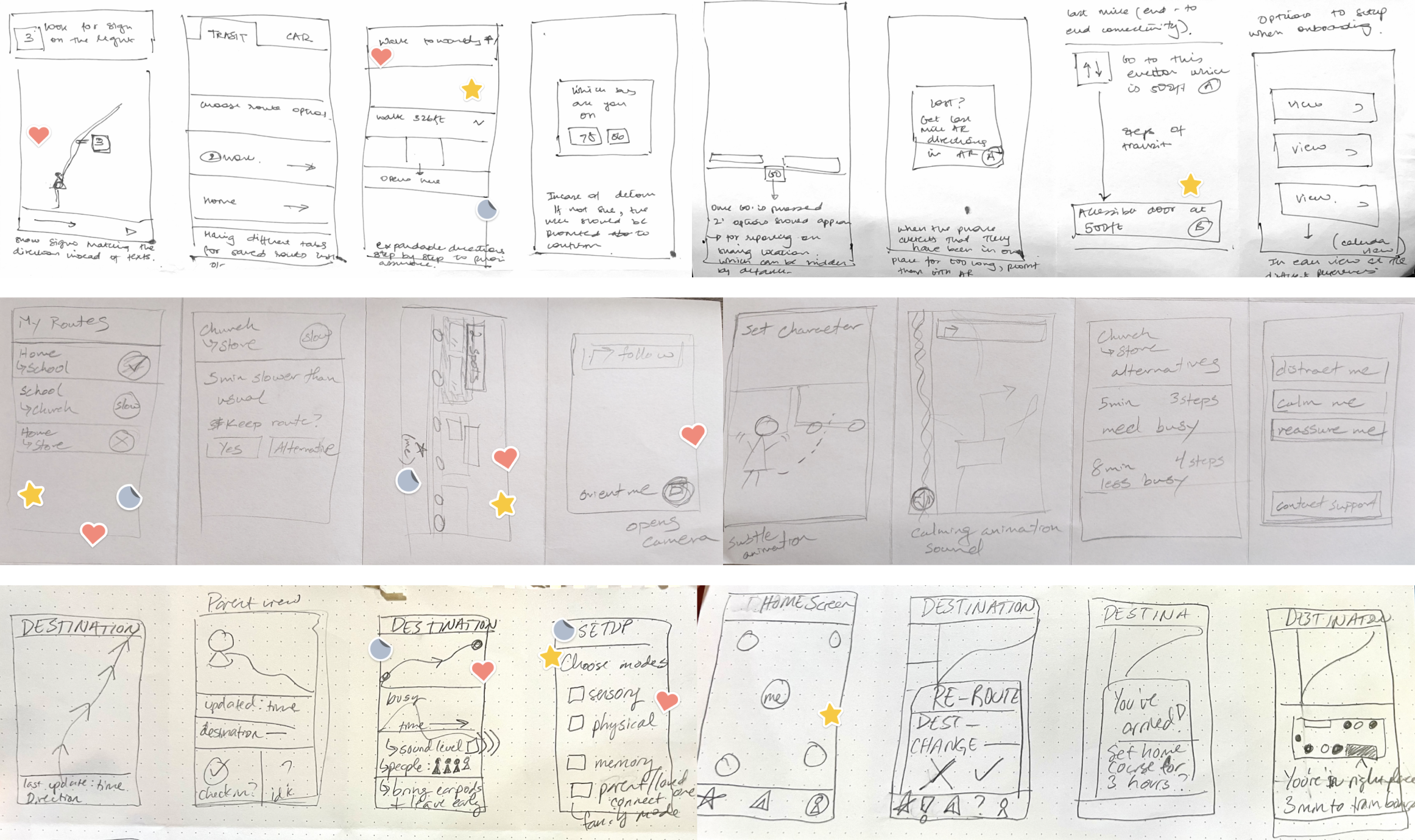
Wireframing
We each took several ideas from our sketches and created mid-fidelity screens. We came back together as a team to discuss the designs, discarding, modifying, or combining ideas to create cohesive flows.
We went through several iterations and consistently revisited our personas and pain points to ensure alignment before moving on to high-fidelity.
How did the final iteration meet our goals?
1. Can we provide accurate, real-time information?
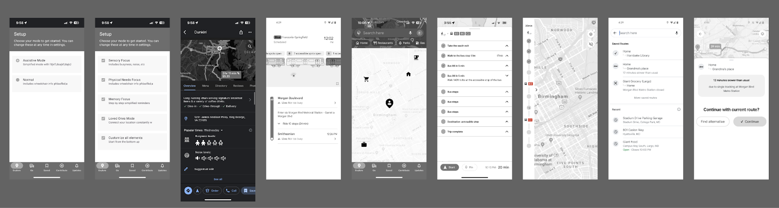
Route, Travel Time, Noise, Busyness
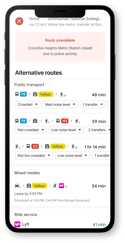
We designed for clear visuals and written text regarding the route, travel time, and busyness. This info would be available at any time, but it would be highlighted in the event that a route changes or is suddenly unavailable.
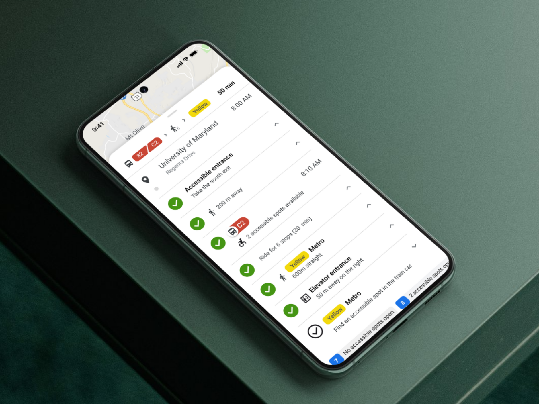
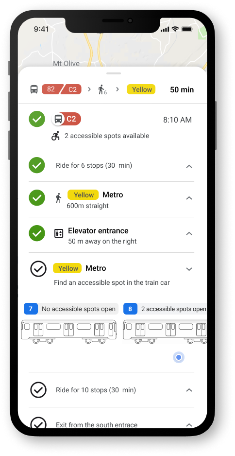
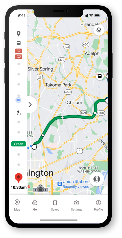
Last Mile Guidance
Our users can open the side panel to access step by step guidance. We've included checks for completed steps, last mile guidance to the building door, and a clear visual of which metro car has accessible spots open.
Need for Sensors or Other Data Collection
The level of real time data for which we have designed is ideal, yet is not currently available. Our team believes that a future viable solution could be sensors in the seatbelts of the wheelchair seating on buses or seat or floor sensors in trains. Crowd-sourcing is already utilized by Google and could be leveraged for other measures (such as noise), but further research would need to be done.
2. Can we create reliable & easy to use features for transit users
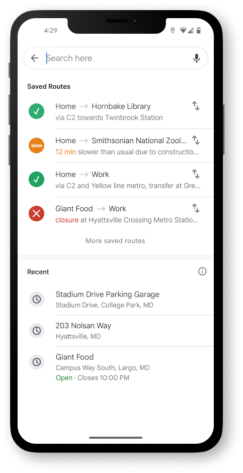
Saved Routes
Google Maps currently allows for saved destinations, but this feature would remember the specific route chosen, supporting users with autism or anxiety who rely on familiar routes and routines, as well as other users who simply prefer certain routes, even if they are not the fastest option.
Simplified Views
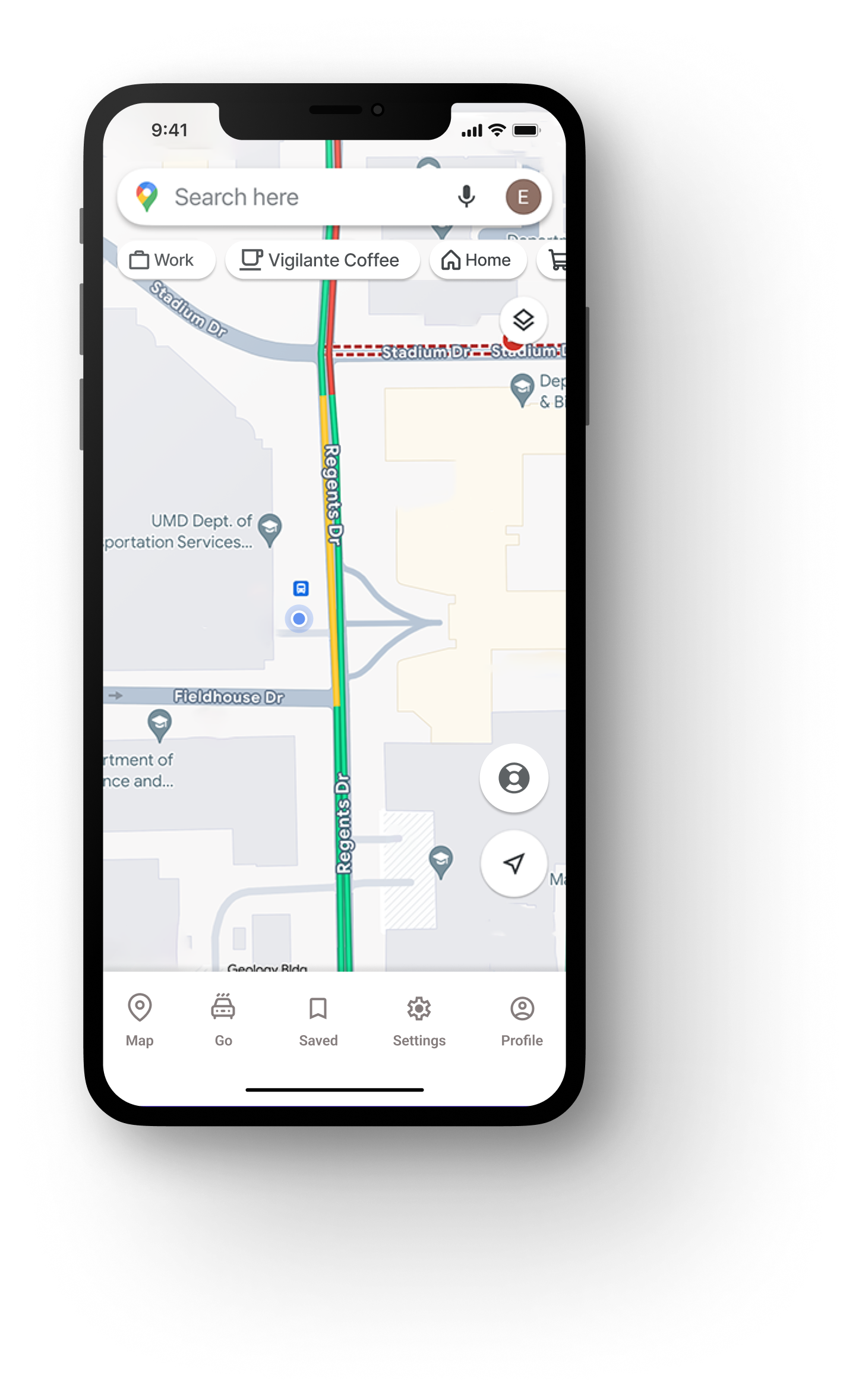
On our home screen, the map view has been simplified to remove many of the location dots and advertised shops that are normally included. We have also added a life saver ring icon to indicate a need for help. And the top bar under the search bar shows a user's personalized most common places to go rather than common searches.
3. Can we make users feel comfortable and confident in their solo travel?
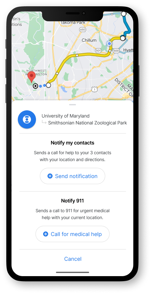
Lifesaver Button
If our user had felt worried or overwhelmed, they could click the lifesaver button in the bottom right of the screen to notify three preset contacts for help with a shared location or notify 911 immediately without leaving the app in case of an emergency.
Preview Side Panel
On the left side of the screen, there is a side panel showing a simplified view of our route with the blue dot icon indicating our progress. This gives a sense of security and reassurance to the user without overwhelming them with too much info.
Watch the full prototype and case study here:
Reimagining a More Accessible Google Maps
UX Research | UX Design | Product Design | AI-Assisted Workflow
An app designed from the first idea to final prototype, focused on increasing adoption and adherence for older adult users.
Overview
In this course project, my goal was to create expanded accessibility features for mobile use of Google Maps focused especially on: cognitive impairments, anxiety related mental illnesses, and physical impairments.
My team wanted to support reliable and user friendly transit guidance for our users by creating a simplified assistive mode within Google Maps, which addresses the transit needs for different disability groups and creates a less stressful experience.
This project features AI-assisted workflow and showcases how AI can be used to supplement traditional user research such as interviews for a more rapid product iteration.
Role
UX Designer & Researcher | Team of 3
Project
Course Project during Master’s of Human-Computer Interaction

“I wish there was a button on the app that would just say ‘for retirees and for non-retirees.’ You click on that button and it would be kinder. It doesn’t assume.
There’s a world of difference between a 20 yr old and 70 yr old in terms of how fast they go through the app. I wish there was a button that said, please be patient, student driver.”
-- Excerpt from Interview with User 1
How did I establish a clear direction?
Due to a short timeline, my team followed the Google Sprint format and AI-assisted workflows. Based on this format, we started with understanding our users with key questions, personas, and research.
1. Can we provide accurate, real-time information?
2. Can we create reliable & easy to use features for transit users
3. Can we make users feel comfortable and confident in their solo travel?

How did I understand our users?
Defining Parameters
Our targeted users are people with motor impairments (permanent, temporary, and situational), people with cognitive impairments (such as Autism Spectrum Disorder and Down’s Syndrome), and people with mental health challenges (specifically anxiety-related mental illnesses). We narrowed this group down to a more manageable audience with the following parameters:
- Adults (16-70 years)
- Able to go on public transportation independently
- Able to follow a routine and navigate mostly on their own
- Able to communicate their needs either verbally or through assistive technology
- Fairly active with existing jobs, hobbies, or social groups
First Round: AI-Generated Personas
We asked ChatGPT to generate several user personas based on our target audience segments, specifically asking for a diverse range of demographics, behaviors, goals, etc.We then used those results as the basis for our final personas, modifying and adding elements to better illustrate the impacts of the challenges faced by our target users.
How did I process qualitative data into insights?
Second Round: Remote User Interviews
Due to lack of resources and time, our team pivoted and took a convenience sample for our interviews that included people adjacent to users with disabilities rather than the users with disabilities themselves.
Our final group of participants included a mother with anxiety traveling with young kids, a retiree with short-term memory loss, as well people adjacent to users with disabilities: a special needs school aide and a mother of a son with severe autism. We conducted remote interviews to explore what their experience and sentiments were surrounding public transportation. By keeping the questions open-ended and intentionally avoiding any bias, we were able to gather new insights.
”A lot of time we underestimate [autistic adult children], we use our standards to test them. Reading and comprehension is hard, but he leverages other skills.”
-- User 2
“ If it’s simple directions I feel like it’ll be okay. When I pull it up and it’s a lot of directions I start [mimics heavy breathing]. That gives me stress when it doesn’t tell you the next step fast enough.
-- User 3
“I know I should go to Google maps, but there’s something... My eyes or the layout... I don’t know why I don’t like it. Directions on left and map on right. The more preview the better for me.”
-- User 3
Pinpointing Pain Points
From our user interviews, we found that pain points can be categorized into three stages:
- Planning the route beforehand
- Matching the physical world to digital instructions
- Adapting to unexpected obstacles.
How did I translate pain points into design iterations?
Lightning Demos
For rapid feature identification, our team conducted lightning demos from comparable apps to evaluate which features might be worth implementing or exploring further. This led us into the mindset for sketching.
User Map
We created individual user maps for three specific personas and then distilled those down into one simplified, combined user map which lays out the process of navigating public transit. We mapped specific insights from our affinity diagram onto the flow to help us identify key aspects to focus on in the ideation phase.
Sketching
Our team used Crazy 8’s to start our sketches, and landed on some key features including:
- Visuals of accessibility features such as highlighted areas on a train car indicating open accessible seating
- Increased preview of upcoming steps while staying collapsed
- Indicators for busyness, sound levels, and other sensory stimuli
- Saved routes (not just bookmarked destinations)
- Preset emergency contacts for both support and/or crisis
Wireframing
We each took several ideas from our sketches and created mid-fidelity screens.
We came back together as a team to discuss the designs, discarding, modifying, or combining ideas to create cohesive flows.
We went through several iterations and consistently revisited our personas and pain points to ensure alignment before moving on to high-fidelity.
How did the final iteration meet our goals?
1. Can we provide accurate, real-time information?
Route, Travel Time, Noise, Busyness
We designed for clear visuals and written text regarding the route, travel time, and busyness. This info would be available at any time, but it would be highlighted in the event that a route changes or is suddenly unavailable.
Last Mile Guidance
Our users can open the side panel to access step by step guidance. We've included checks for completed steps, last mile guidance to the building door, and a clear visual of which metro car has accessible spots open.
Need for Sensors or Other Data Collection
The level of real time data for which we have designed is ideal, yet is not currently available. Our team believes that a future viable solution could be sensors in the seatbelts of the wheelchair seating on buses or seat or floor sensors in trains. Crowd-sourcing is already utilized by Google and could be leveraged for other measures (such as noise), but further research would need to be done.
2. Can we create reliable & easy to use features for transit users
Saved Routes
Google Maps currently allows for saved destinations, but this feature would remember the specific route chosen, supporting users with autism or anxiety who rely on familiar routes and routines, as well as other users who simply prefer certain routes, even if they are not the fastest option.
Simplified Views
On our home screen, the map view has been simplified to remove many of the location dots and advertised shops that are normally included. We have also added a life saver ring icon to indicate a need for help. And the top bar under the search bar shows a user's personalized most common places to go rather than common searches.
3. Can we make users feel comfortable and confident in their solo travel?
Lifesaver Button
If our user had felt worried or overwhelmed, they could click the lifesaver button in the bottom right of the screen to notify three preset contacts for help with a shared location or notify 911 immediately without leaving the app in case of an emergency.
Preview Side Panel
On the left side of the screen, there is a side panel showing a simplified view of our route with the blue dot icon indicating our progress. This gives a sense of security and reassurance to the user without overwhelming them with too much info.
Watch the full prototype and case study here:
Reimagining a More Accessible Google Maps
UX Research | UX Design | Product Design | AI-Assisted Workflow
Analyzing inclusivity of Google Maps navigation and designing more accessible features using sensors and data visualizations.
Overview
In this course project, my goal was to create expanded accessibility features for mobile use of Google Maps focused especially on: cognitive impairments, anxiety related mental illnesses, and physical impairments.
My team wanted to support reliable and user friendly transit guidance for our users by creating a simplified assistive mode within Google Maps, which addresses the transit needs for different disability groups and creates a less stressful experience.
This project features AI-assisted workflow and showcases how AI can be used to supplement traditional user research such as interviews for a more rapid product iteration.
Role
UX Designer & Researcher | Team of 3
Project
Course Project during Master’s of Human-Computer Interaction

“I wish there was a button on the app that would just say ‘for retirees and for non-retirees.’ You click on that button and it would be kinder. It doesn’t assume.
There’s a world of difference between a 20 yr old and 70 yr old in terms of how fast they go through the app. I wish there was a button that said, please be patient, student driver.”
-- Excerpt from Interview with User 1
How did I establish a clear direction?
Due to a short timeline, my team followed the Google Sprint format and AI-assisted workflows. Based on this format, we started with understanding our users with key questions, personas, and research.
1. Can we provide accurate, real-time information?
2. Can we create reliable & easy to use features for transit users?
3. Can we make users feel comfortable and confident in their solo travel?

How did I understand our users?
Defining Parameters
Our targeted users are people with motor impairments (permanent, temporary, and situational), people with cognitive impairments (such as Autism Spectrum Disorder and Down’s Syndrome), and people with mental health challenges (specifically anxiety-related mental illnesses). We narrowed this group down to a more manageable audience with the following parameters:
- Adults (16-70 years)
- Able to go on public transportation independently
- Able to follow a routine and navigate mostly on their own
- Able to communicate their needs either verbally or through assistive technology
- Fairly active with existing jobs, hobbies, or social groups
First Round: AI-Generated Personas
We asked ChatGPT to generate several user personas based on our target audience segments, specifically asking for a diverse range of demographics, behaviors, goals, etc.We then used those results as the basis for our final personas, modifying and adding elements to better illustrate the impacts of the challenges faced by our target users.
How did I process qualitative data into insights?
Second Round: Remote User Interviews
Due to lack of resources and time, our team pivoted and took a convenience sample for our interviews that included people adjacent to users with disabilities rather than the users with disabilities themselves.
Our final group of participants included a mother with anxiety traveling with young kids, a retiree with short-term memory loss, as well people adjacent to users with disabilities: a special needs school aide and a mother of a son with severe autism. We conducted remote interviews to explore what their experience and sentiments were surrounding public transportation. By keeping the questions open-ended and intentionally avoiding any bias, we were able to gather new insights.
”A lot of time we underestimate [autistic adult children], we use our standards to test them. Reading and comprehension is hard, but he leverages other skills.”
-- User 2
“ If it’s simple directions I feel like it’ll be okay. When I pull it up and it’s a lot of directions I start [mimics heavy breathing]. That gives me stress when it doesn’t tell you the next step fast enough.
-- User 3
“I know I should go to Google maps, but there’s something... My eyes or the layout... I don’t know why I don’t like it. Directions on left and map on right. The more preview the better for me.”
-- User 3
Pinpointing Pain Points
From our user interviews, we found that pain points can be categorized into three stages:
- Planning the route beforehand
- Matching the physical world to digital instructions
- Adapting to unexpected obstacles.
How did I translate pain points into design iterations?
User Map
We created individual user maps for three specific personas and then distilled those down into one simplified, combined user map which lays out the process of navigating public transit. We mapped specific insights from our affinity diagram onto the flow to help us identify key aspects to focus on in the ideation phase.
Lightning Demos
For rapid feature identification, our team conducted lightning demos from comparable apps to evaluate which features might be worth implementing or exploring further. This led us into the mindset for sketching.
Sketching
Our team used Crazy 8’s to start our sketches, and landed on some key features including:
- Visuals of accessibility features such as highlighted areas on a train car indicating open accessible seating
- Increased preview of upcoming steps while staying collapsed
- Indicators for busyness, sound levels, and other sensory stimuli
- Saved routes (not just bookmarked destinations)
- Preset emergency contacts for both support and/or crisis
Wireframing
We each took several ideas from our sketches and created mid-fidelity screens. We came back together as a team to discuss the designs, discarding, modifying, or combining ideas to create cohesive flows.
We went through several iterations and consistently revisited our personas and pain points to ensure alignment before moving on to high-fidelity.
How did the final iteration meet our goals?
1. Can we provide accurate, real-time information?
Route, Travel Time, Noise, Busyness
We designed for clear visuals and written text regarding the route, travel time, and busyness. This info would be available at any time, but it would be highlighted in the event that a route changes or is suddenly unavailable.
Last Mile Guidance
Our users can open the side panel to access step by step guidance. We've included checks for completed steps, last mile guidance to the building door, and a clear visual of which metro car has accessible spots open.
Need for Sensors or Other Data Collection
The level of real time data for which we have designed is ideal, yet is not currently available. Our team believes that a future viable solution could be sensors in the seatbelts of the wheelchair seating on buses or seat or floor sensors in trains. Crowd-sourcing is already utilized by Google and could be leveraged for other measures (such as noise), but further research would need to be done.
2. Can we create reliable & easy to use features for transit users?
Saved Routes
Google Maps currently allows for saved destinations, but this feature would remember the specific route chosen, supporting users with autism or anxiety who rely on familiar routes and routines, as well as other users who simply prefer certain routes, even if they are not the fastest option.
Simplified Views
On our home screen, the map view has been simplified to remove many of the location dots and advertised shops that are normally included. We have also added a life saver ring icon to indicate a need for help. And the top bar under the search bar shows a user's personalized most common places to go rather than common searches.
3. Can we make users feel comfortable and confident in their solo travel?
Lifesaver Button
If our user had felt worried or overwhelmed, they could click the lifesaver button in the bottom right of the screen to notify three preset contacts for help with a shared location or notify 911 immediately without leaving the app in case of an emergency.
Preview Side Panel
On the left side of the screen, there is a side panel showing a simplified view of our route with the blue dot icon indicating our progress. This gives a sense of security and reassurance to the user without overwhelming them with too much info.